By Catherine Austin Fitts
My “go to” website for technical analysis of precious metals, the US dollar & the US stock market is Rambus Chartology, where Rambus (that’s his handle – he’s the founding technical analyst) leads a discussion with extensive charts of what the markets are saying.
In January 2016, Rambus launched his quarterly Solari Report with a Blockbuster Chartology. You can find links to the entire series of quarterly and annual Blockbuster Chartologies at the end of this latest piece.
One of the reasons that Rambus is so good at his craft is that he focuses on “staying on the right side of the major trend.” The challenge of doing so at this time is that it is tempting to look for bottoms or to assume that the trend upwards in the US dollar or stock market may be over. However, Rambus consistently brings us back to the discipline of the Chartology. What does price tell us? As he describes so aptly, we are dealing with psychological warfare.
Sitting back once each quarter to get this perspective offers invaluable insight. So, here we go for the Annual 2019 Blockbuster Chartology!
Blockbuster Chartology Quarterly Report
By Rambus
~ Annual 2019 Wrap Up ~
Quarterly Report Part 1 : US Stock Markets
Quarterly Report Part 2 : World Stock Markets
Quarterly Report Part 3 : Sectors Within the Stock Markets…
Quarterly Report Part 4 : Precious Metals Complex…
Quarterly Report Part 5 : Odds and Ends
Quarterly Report Part 1… US Stock Markets
It’s that time again when I break out the long term charts for the “Quarterly Report” that I do for Catherine Austin Fits who is the founder of the Solari Report. Doing these quarterly reports every three months forces me to look at the long term picture for the stock markets and other areas of the markets which is the most important aspect of trading the intermediate to long term trends.
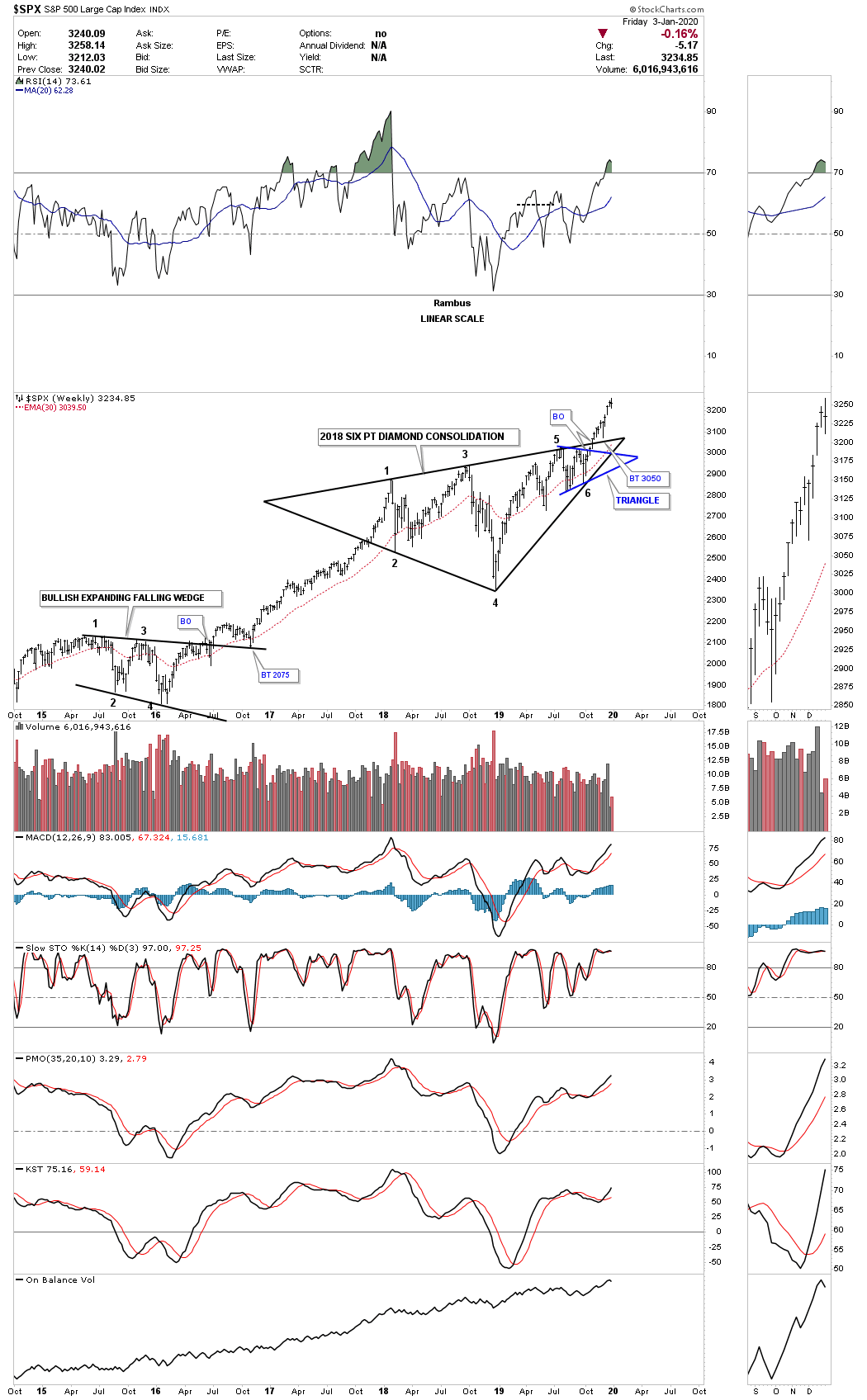
Since the 3rd Quarterly Report, which showed the January 2018 consolidation patterns still under construction, we finally got some positive price action with most of the US stock markets completing their 2018 consolidation patterns. It has taken close to 22 months to consolidate the last impulse leg up which began in January of 2016 and ran for 2 years. This is how bull markets work, a consolidation pattern followed by an impulse move followed by another consolidation pattern so on and so forth until the bull market ends where we will see a reversal pattern instead of a consolidation pattern.
This monthly chart shows the four year H&S bottom with the head that formed at the 2009 crash low. During the 2015 correction the SPX consolidated the first impulse move up by creating the blue expanding falling wedge halfway pattern. The blue expanding falling wedge had a price objective up to 2875 using the breakout to breakout method, blue arrows, which is where our current trading range began to form in January of 2018.
As you can see we finally got the bullish breakout just 2 months ago in November of 2019 which should now lead to the next impulse move higher. The next impulse leg up should look similar in nature to the impulse moves between each consolidation pattern which could have a price objective up to the 3835 area. At this point I can’t rule out a backtest to the top rail of the expanding triangle which would come into play around the 3050 area.

To put the 2018 expanding triangle into perspective below is a 25 year monthly chart for the SPX which shows the beautiful Chartology going back to the last rally phase beginning in 1995 that ended the previous secular bull market in 2000. It took 13 years to consolidate that massive secular bull market which was needed to launch our current secular bull market that began in March of 2009.
The 2007 bear market that ended in 2009 formed the H&S bottom which reversed that bear market to a bull market. The first consolidation pattern that formed during the initial stage of the new bull market formed the blue bullish rising wedge just below the all time high at 1576 which is classic Chartology. Breaking out above the 2000 secular bull market high at 1576 confirmed a new secular bull market was truly beginning. After a 2 year rally into new all time highs it was time for the SPX to consolidate those gains by forming the 2015 bullish expanding falling wedge halfway pattern.
When you look at the 2015 expanding falling wedge you can see how it fits right at the halfway point between the breakout from the 2000 high at 1576 to the January 2018 high. When the current impulse move is finished a year or so down the road it should have a similar halfway look that formed between the 2015 bullish expanding falling wedge halfway pattern and the 2018 expanding triangle. You can also see the bullish rising wedge which formed as a halfway pattern during the 2002 to 2007 bull market.
Before we move on lets look at the RSI at the top of the chart. Most technicians would view the current RSI as showing a negative divergence because the RSI is way below its January 2018 high while the SPX is making new all time highs. During a strong bull market it is common for the RSI to correct while the price action of a stock gives up little ground which I view as a very bullish setup.
Looking at the 2015 high you can see how the RSI dropped all the way down to 50 while the SPX had a modest decline forming the bullish expanding falling wedge. Note how low the RSI got when the SPX broke out from the 2015 bullish expanding falling wedge. While the SPX was just beginning to make new all time highs once again the RSI was fully charged and wouldn’t become oversold again until the 2018 high was reached. The SPX and RSI are back in the exact same position they were in 2015 with the SPX breaking out to new all time highs while the RSI still has a long ways to rise before it becomes oversold once again.
With the 2018 trading range completed, below is a 75 year quarterly chart which shows how the 2018 expanding triangle fits into the very big picture which looks very small. You can compare the impulse move out of the 1970s massive bullish rising wedge to our current impulse move out of the 13 year bullish expanding flat top triangle. You can also see the 1987 crash, which is still the biggest one day percentage move in history for the SPX which doesn’t look that bad from the long term perspective.
I know how hard it is for most investors to grasp the importance of what this chart has been strongly suggesting since the 2013 breakout from the 13 year bullish flat top expanding triangle. We should still have 10 more years to go before this secular bull market that began in 2009 is exhausted. There will be corrections and shakeouts along the way but nothing like the 2007 to 2009 bear market. As is the case with most strong impulse moves corrections are more of a time thing meaning, instead of a deep decline the correction will be shallow, but time consuming as shown by the bullish rising wedge.
One reason I believe the 2018 correction is over is because there are several other consolidation patterns that have formed besides the expanding triangle. It is not at all uncommon to see several different consolidation patterns form during a correction. To show you what I mean, below is a H&S consolidation pattern for the SPX which has formed since the 2018 high. Note how long it took to complete the backtest to the neckline in 2016 before the new impulse leg began in earnest. There is no way to know if we’ll see a similar backtest to the 3050 area, but it is something to be aware of.
Another bullish consolidation pattern that has formed since the 2018 high is the bullish rising wedge which broke out above the top rail on November 4th of 2019 with the backtest to the top rail on December 2nd of 2019.
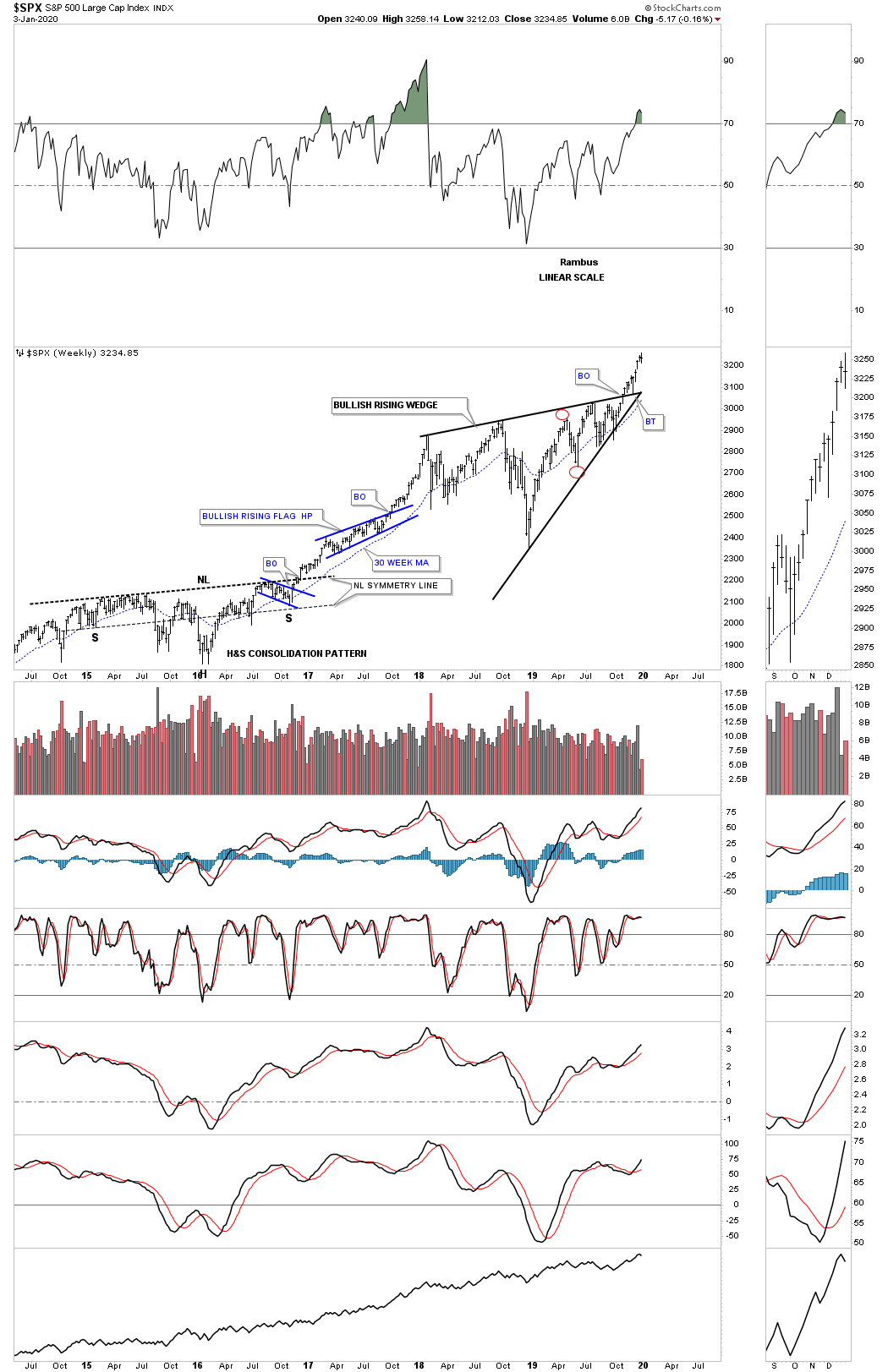
Believe it or not I have one more 2018 consolidation pattern that has been working out very well which is the 6 point diamond. Note the blue triangle that formed at the apex which strongly suggested the breakout above the top rail of the 2018 six point diamond was going to happen.
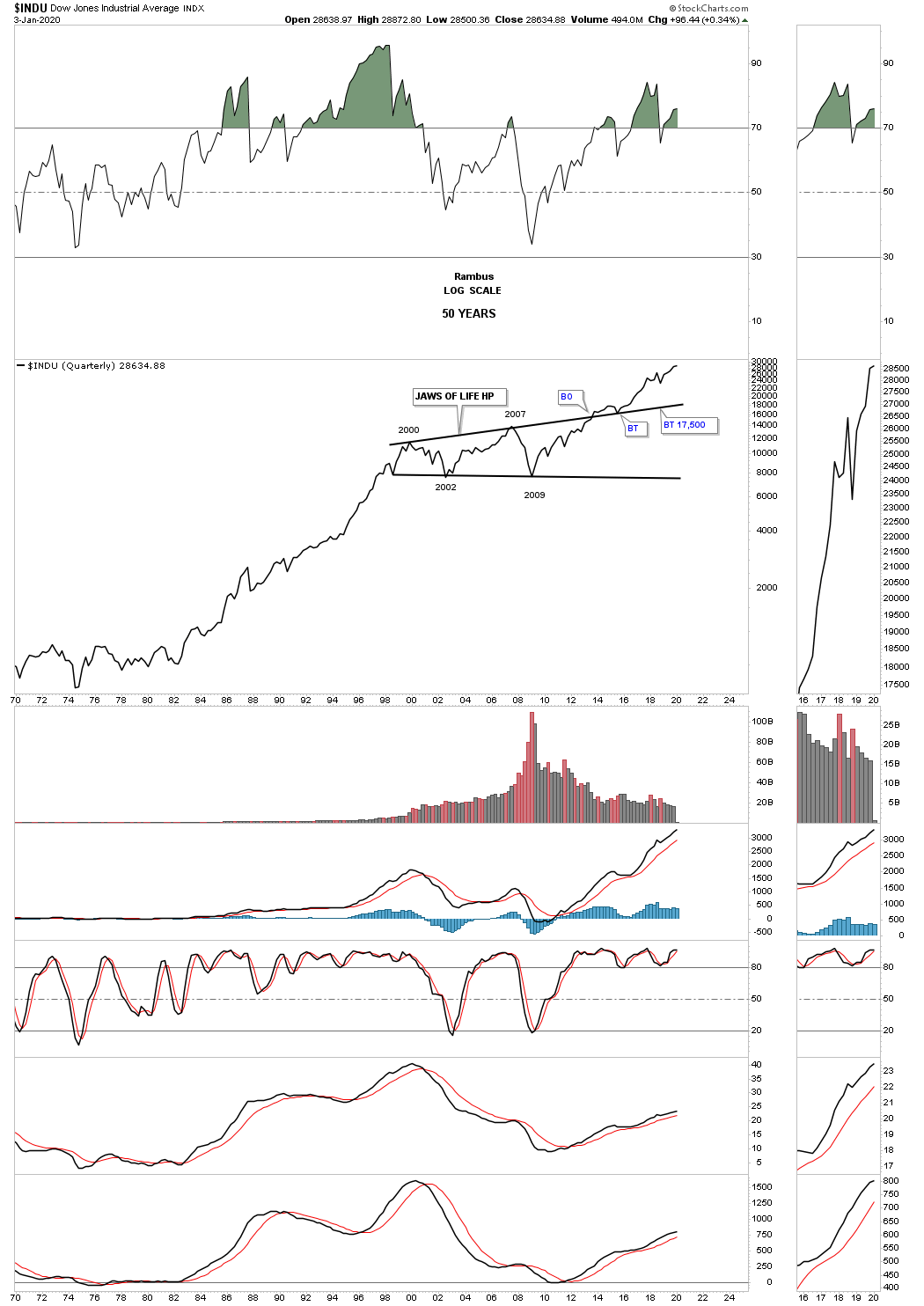
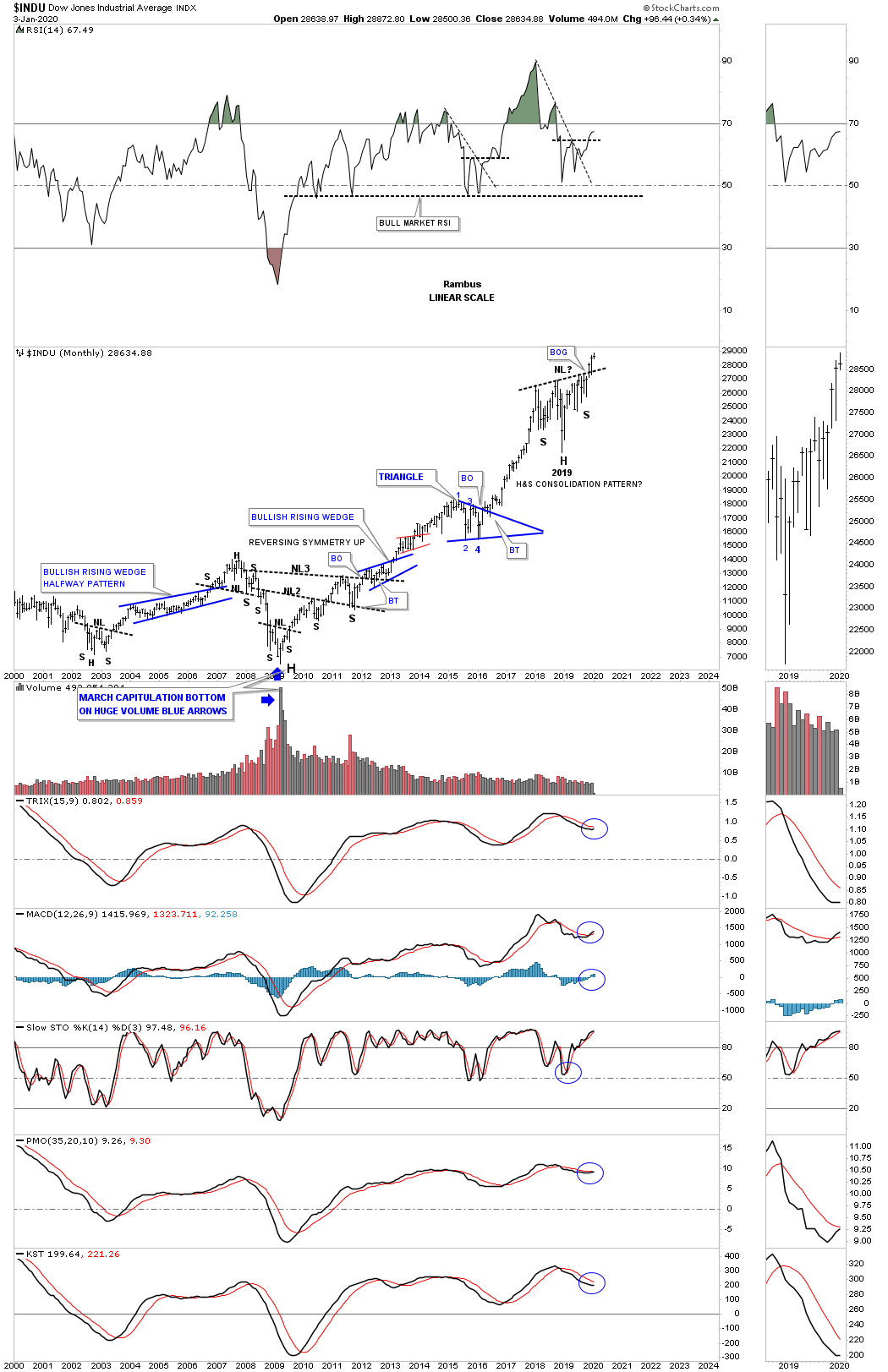
Next lets look at the INDU and the infamous “JAWS OF LIFE” consolidation pattern that many were calling the, Jaws of Death, and the end of the bull market during its formation. Just like most of the big 13 year consolidation patterns that have formed on many of the US stock markets the INDU did breakout above the top rail of its 2013, Jaws of Life consolidation pattern, but it had a laborious backtest which took several years to complete. Even though the backtesting process took a long time to complete I never gave up that we would see a bullish outcome which we had already seen with the SPX. Note our current consolidation pattern, the blue expanding triangle, which I’ve labeled as, “Baby Jaws of Life.” with the father being the 13 year “Jaws of Life”. We now have the breakout with a possible backtest to the top rail at 3050.

Next is the 75 year quarterly chart for the INDU which puts the 13 year Jaws of Life consolidation pattern into perspective. First note the 17 year H&S consolidation pattern which formed from 1966 to the breakout in 1982 which again led to the secular bull market that ended in 2000. Most have forgotten the worse trading day in US history occurred in 1987 that truly felt like the end of the world. As you can see what felt like the end of the world was only the beginning of the next consolidation phase that built out the bullish rising wedge halfway pattern. Note how similar the breaking out and backtesting process was to the 1970’s neckline and the top rail of the Jaws of Life. That’s classic Chartology on any timeframe.

Sometimes just a simple line chart can show a very clear chart pattern without any noise.
Below is a monthly line chart which shows the 2009 bull market chart patterns.
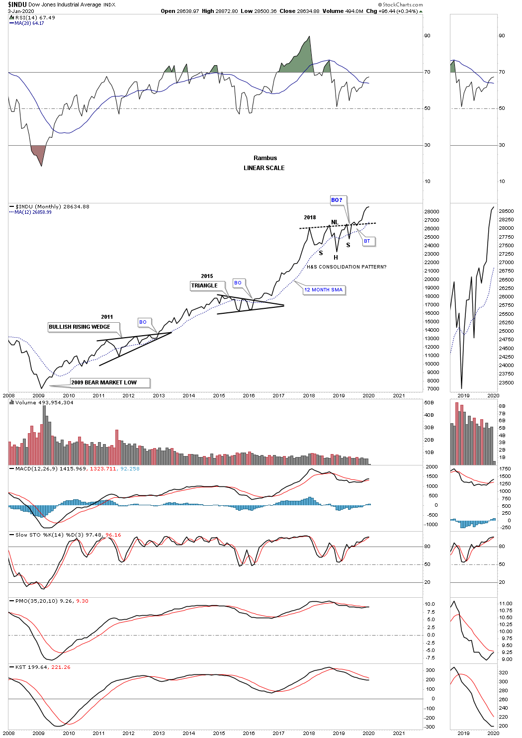
Besides the expanding triangle that is prevalent on many of the US stock markets there is also the 2018 H&S consolidation pattern which the INDU is clearly showing.
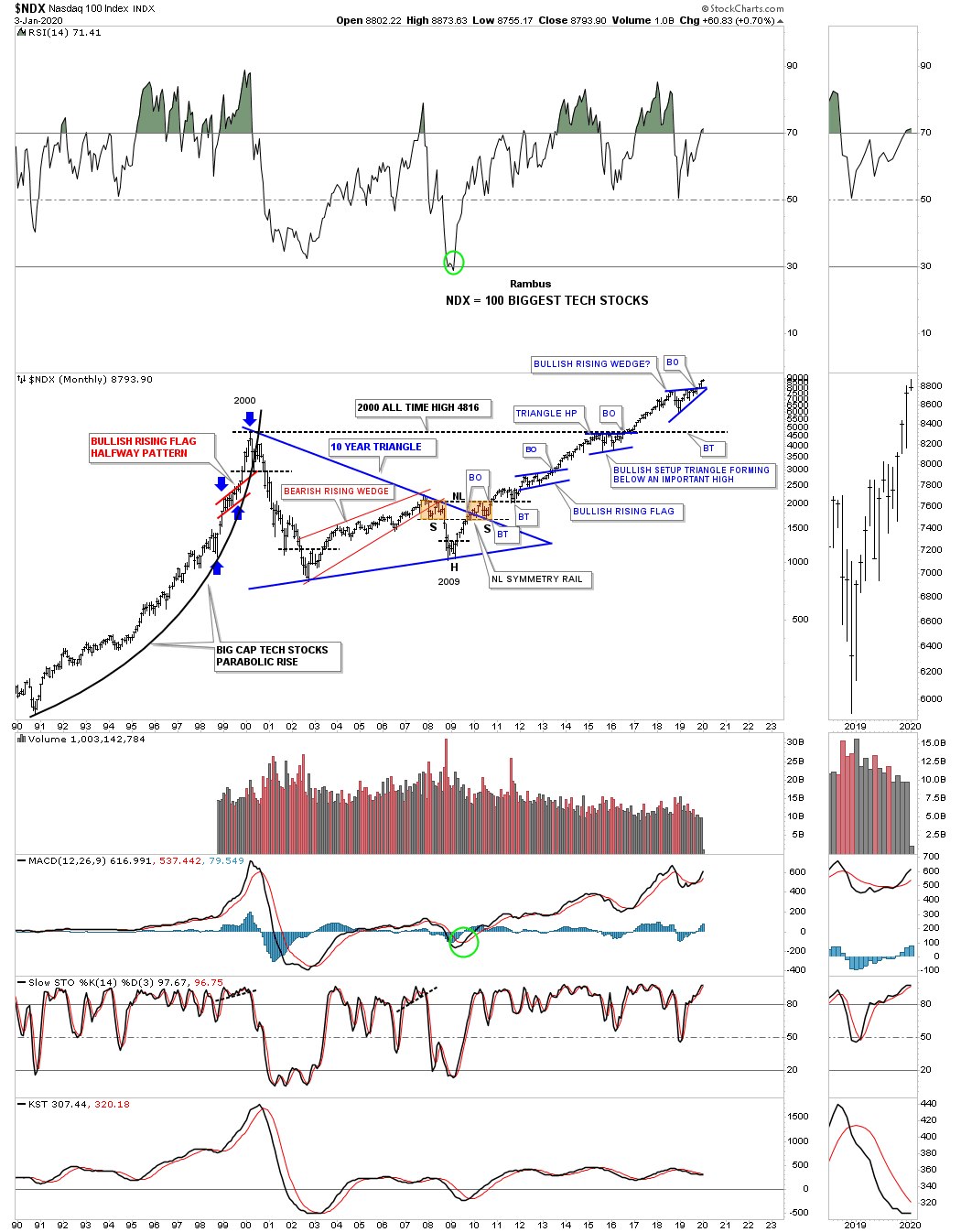
During the last secular bull market the NDX 100 produced a parabolic move into its 2000 high which marked the beginning of its 10 year triangle consolidation pattern. Note the classic H&S bottom that formed at the last reversal point in the 10 year triangle with the left shoulder and head forming inside the triangle while the right shoulder low formed on the backtest to the top rail. Also note the blue triangle that formed just below the all time highs which finally gave the NDX enough energy to breakout above the old all time highs, to new all time highs which has led to our current 2018 trading range.
The NDX is setup a bit differently than the other US stock markets as it has formed a bullish rising wedge instead of an expanding triangle as its 2018 consolidation pattern. Even though the two chart patterns are different they both had their breakouts in November of 2019.
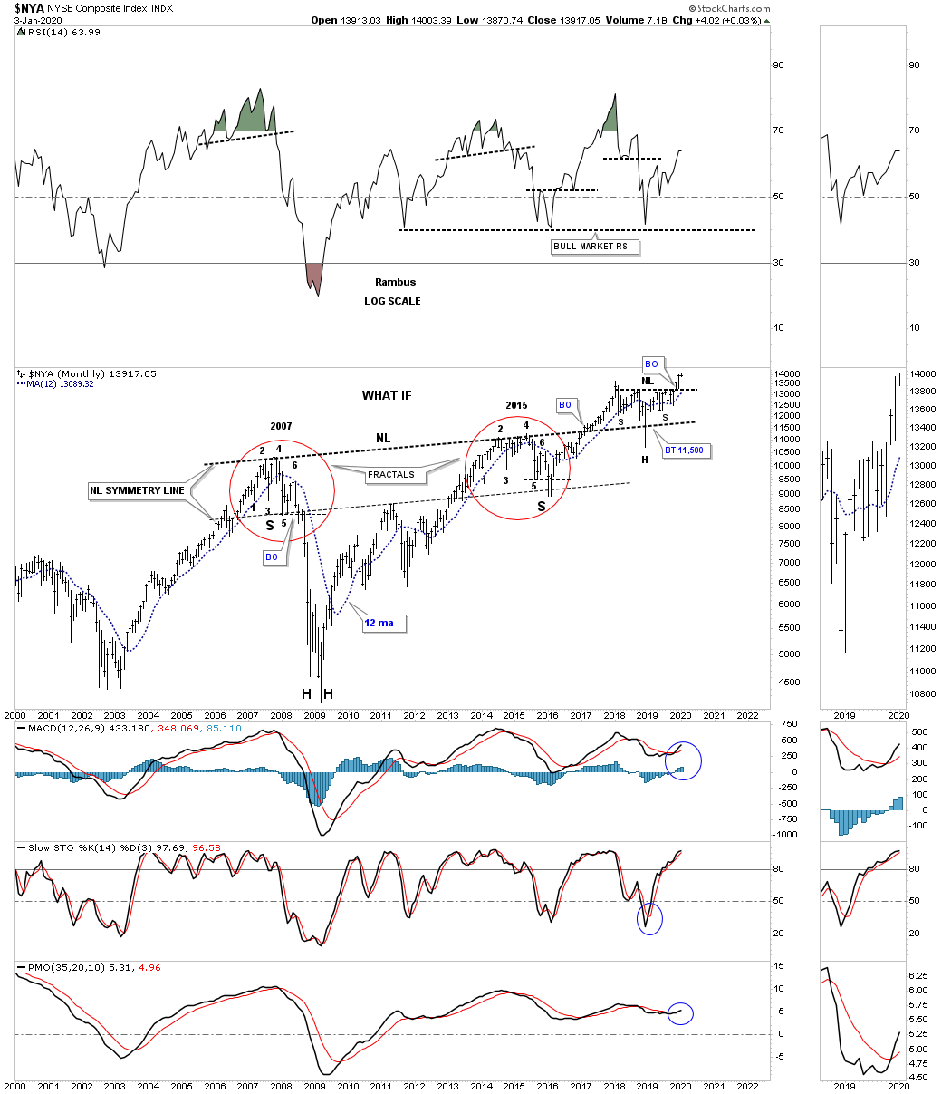
As I’ve mentioned previously the other dominate consolidation pattern for the 2018 correction is a H&S consolidation pattern. Last quarter when we looked at this weekly chart for the NYA, which is a broad measure for US stocks, was still building out the right shoulder. Again, on November 4th the price action took out the neckline with the backtest on December 2nd, 2019.
Please note the 2016 H&S consolidation pattern which led to the NYA’s previous impulse move which ended in January of 2018. That 2016 H&S consolidation pattern had a price objective up to the 13,255 area which was reached. Our current H&S consolidation pattern has a price objective up to the 16,345 area.

I first started showing this long term monthly chart for the $NYA back in 2015 when it looked like the price action was building out a fractal. At the time I was comparing the 2015 price action to the 2007 price action as shown by the red circles. I’m not a big fan of fractals because they usually fall apart just when you think they should work. To see how tight the two fractals were just follow reversal point #1 on the left side and compare it to reversal point #1 on the right side. Then do the same for each number comparing the left side to the right side.
Note the thin dashed horizontal line just below reversal point #5 on each fractal. In 2007 the price action broke below the thin dashed line with a quick backtest and then the crash sequence to the downside. Note that same point just below the horizontal dashed line during the 2015 fractal. You can see the price action broke below reversal point #5 which matched the 2007 fractal to a tee, but then a strange thing happened. Instead of crashing like the 2007 fractal shows the NYA reversed hard to the upside negating the 2007 fractal at the last moment.
In doing so what was left behind was a massive H&S bottom with both fractals being the left and right shoulders. Why this potential massive H&S bottom is still in play is because of the backtest to the neckline which occurred last December on Christmas Eve. It looked like the neckline might be failing but a strong rally negated the strong backtest. The smaller H&S pattern that was forming the backtest to the 10 year neckline was completed when the price action broke out above the neckline on November 4th which is now suggesting much higher prices and gives the massive H&S bottom more credence.
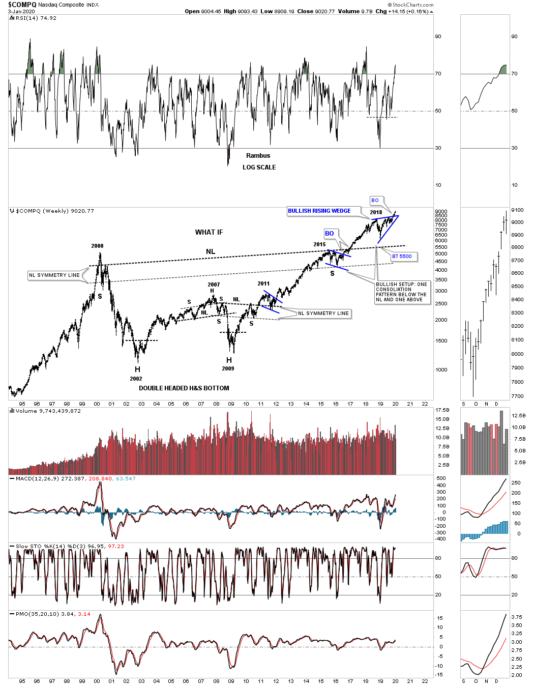
Since we are looking at some massive H&S bottoms there is another one I’ve been following since 2016 which has formed on the COMPQ, tech index. Whenever you discover a large pattern like this you never know how it is going to play out on the front end. There are road signs along the way that you need to pay attention to in order to help confirm the pattern has some validity to it. First, note the blue flag that formed in 2015 which was strongly suggesting the COMPQ was going to move substantially higher. That blue flag also suggested that the massive neckline was going to give way. During the 2018 correction I was watching the neckline very carefully to see if it would be backtested form above around the 5500 area. As you can see the price action held above the neckline so basically the backtest held. The backtest on the monthly chart above for the NYA gave a little ground but held support. And now with the small H&S consolidation pattern completed on the NYA the backtesting process is complete.
Instead of forming a H&S consolidation pattern as the backtest to the neckline on the COMPQ, it built out the blue bullish rising wedge with the breakout complete with a possible backtest to the top rail still a possibility. There is still one more feature that strongly suggests the massive H&S bottom could play out. You can see the NL symmetry line that formed on the massive H&S bottom on the NYA which showed us the low for the right shoulder. The COMPQ also has a neckline symmetry line that showed us the low for its right shoulder. The bottom line is that as long as nothing is broken stick with what the chart pattern is suggesting until it either completes or something breaks regardless of all the reasons it can’t workout.
Below is 35 year look at the OEX 100 which shows its own 13 year bullish expanding falling wedge consolidation pattern. As you can see the 13 year consolidation pattern is very similar to the other indexes we looked at tonight but it is slopping down instead of expanding like the, Jaws of Life, on the INDU.

Next is a 20 year chart for the Transportation Average with the dominate chart pattern being the massive 2009 H&S consolidation pattern which was very symmetrical as shown by the neckline symmetry line. The Transportation Average has been working on its latest consolidation pattern which is the blue diamond. Since the last Quarterly Report the Transportation Average has broken out above its 2 year Diamond consolidation pattern.
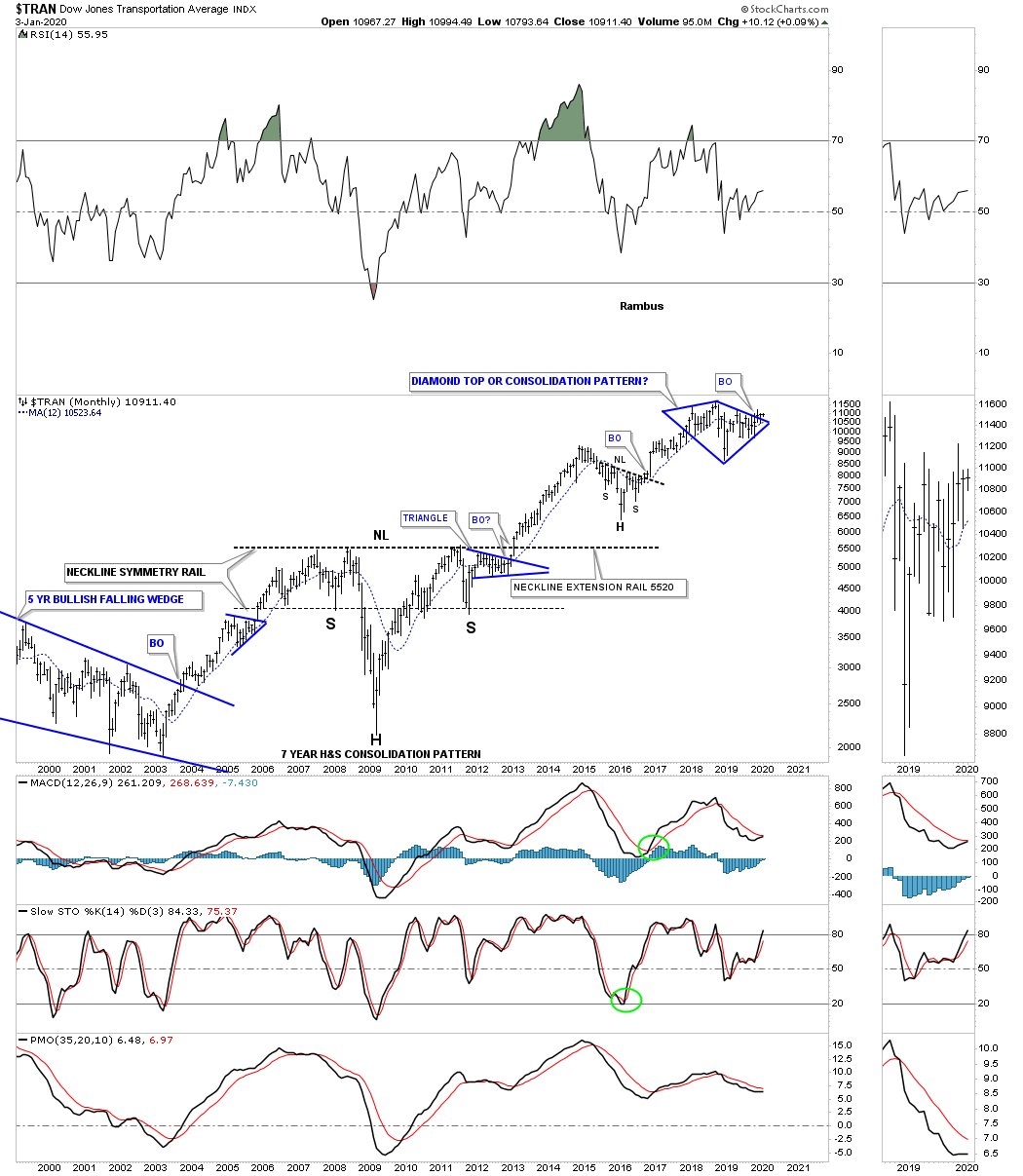
This last chart for tonight is the 100 year quarterly chart for the Transportation Average. If the secular bull market that began in 2009 is going to run until 2030 or so the Transportation Average is going to have to participate in no uncertain terms. There is a potential bullish rising wedge which has been forming since the high in 2014 as the backtest to the H&S consolidation pattern. This is another long term chart which will help guide us through the coming twists and turns the markets will give us letting us know if we are on the right side of history or not.
This concludes part 1 of the Quarterly Report. Next we’ll look at some of the important stock markets from around the world that may be a bit surprising to many. All the best…Rambus
![]()
Quarterly Report Part 2… World Stock Markets
In part 2 of this Quarterly Report we’ll look at some of the larger world stock markets to see if their 2009 bull markets are showing any signs of aging and getting ready to roll over into a bear market as many analysts are projecting. Over the last three months since the last Quarterly Report we have gotten more confirmation that most of the large world stock markets are showing bullish characteristics with many breaking out of large consolidation pattern. Most of the charts below will show a big multi year consolidation pattern which is very similar to many of the multi year patterns that we looked at on the US stock markets in part one of this Quarterly Report.
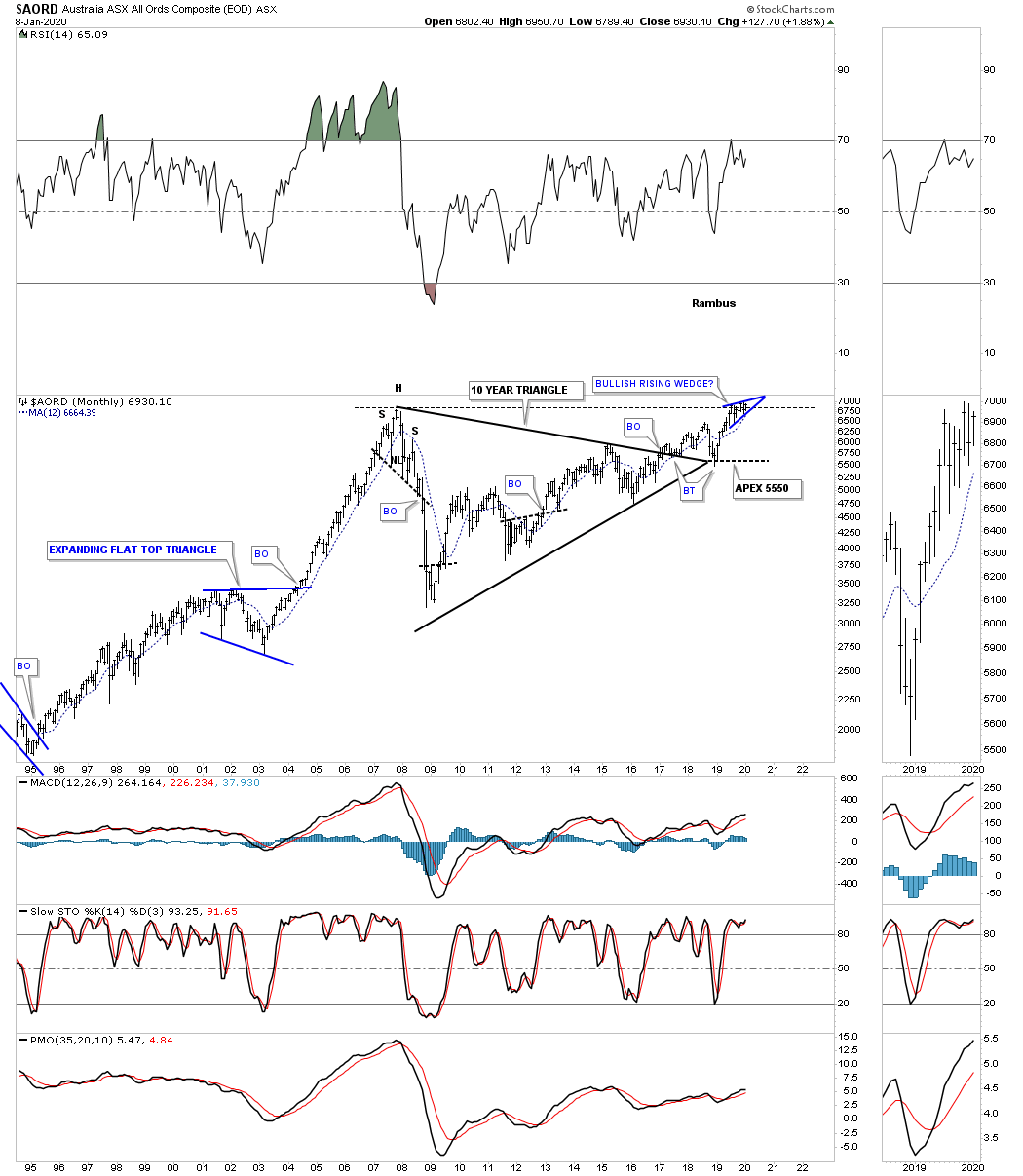
After breaking out from its 10 year triangle consolidation pattern the $AORD, Australian stock market, found support at the apex and is now approaching the all time high made in 2007. This is the point where we should see a slight pause that forms a small consolidation pattern, bullish rising wedge, just below the all time highs if the bulls are going to win the battle. So far so good.
Next is the $BVSP, Brazilian stock market, which has been one of the stronger world stock markets since it broke out from its 10 year triangle consolidation pattern. After a nice clean backtest to the top rail it’s now trading at new all time highs in its steady impulse move higher.

The $BSE, India Bombay stock market, has been another strong performing world stock market which has been steadily climbing higher since its 2009 low forming two H&S consolidation patterns along the way. The price action is currently building out a rising wedge formation. Whichever direction the breakout occurs a big move will follow.

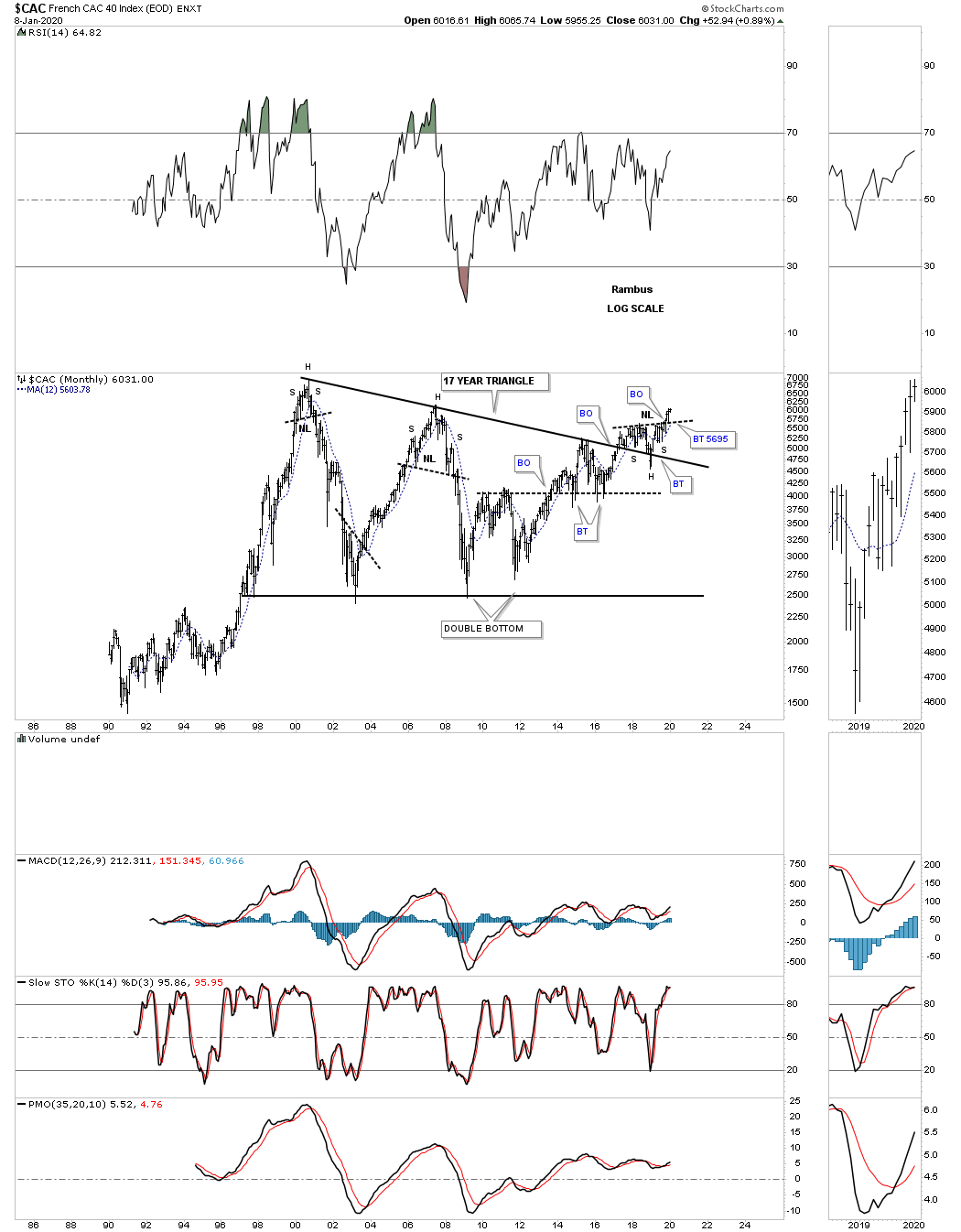
Next is the $CAC, French stock market, that broke out from its 17 year triangle consolidation pattern in March of 2017. There was a strong backtest to the top rail which is now the line in the sand, above is bullish and below is bearish. Since the last Quarterly Report the CAC has completed a H&S consolidation pattern as the backtest to the top rail of the 17 year triangle consolidation pattern. This is generally a very bullish setup.
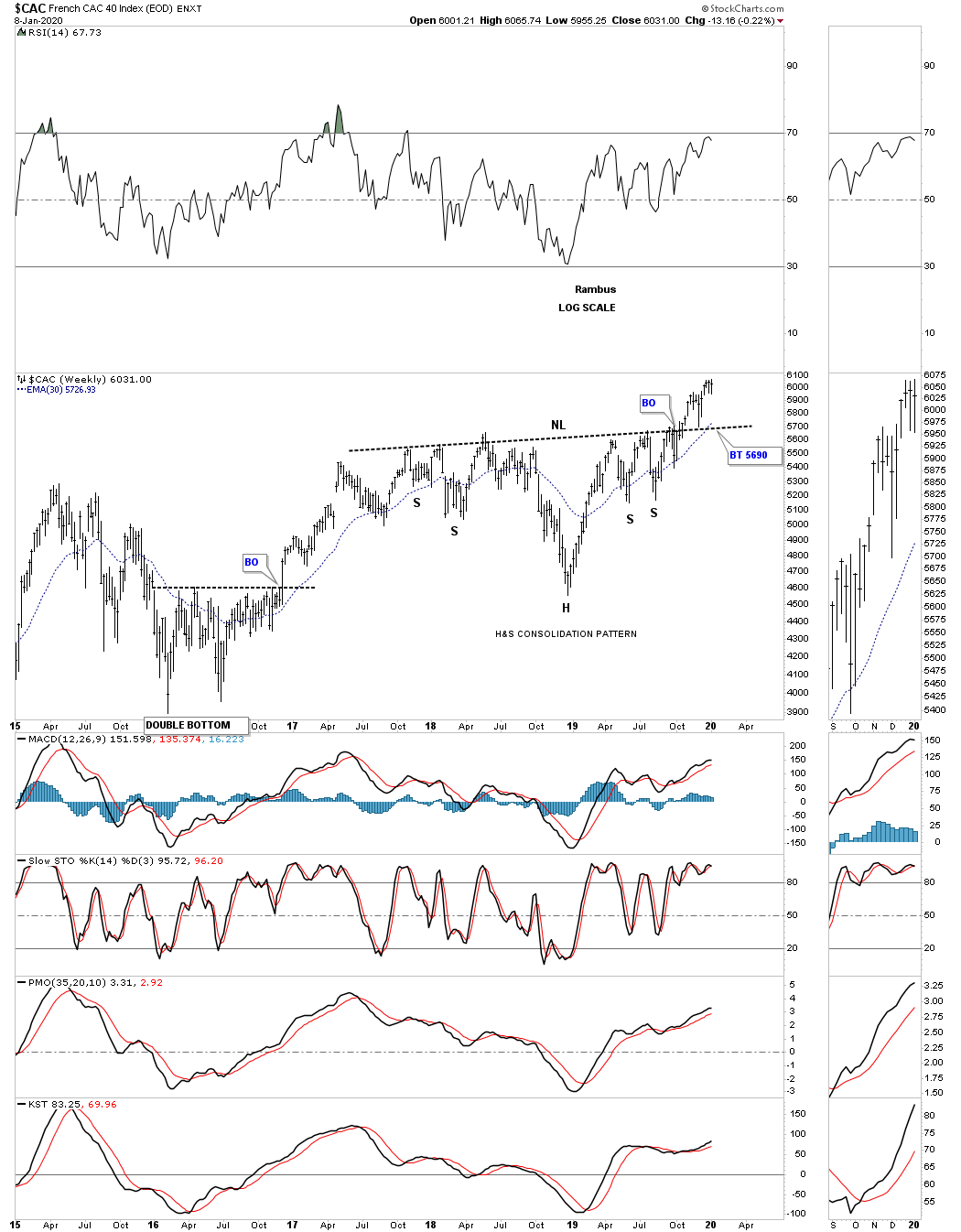
The weekly chart shows the H&S consolidation pattern a little more clearly.
After breaking out from its 12 year triangle consolidation pattern in 2013 along with most of the US stock markets the $DAX, German stock market, is in the process of building out a multi year rising wedge formation just above the top rail of the 12 year triangle which is generally a bullish setup.

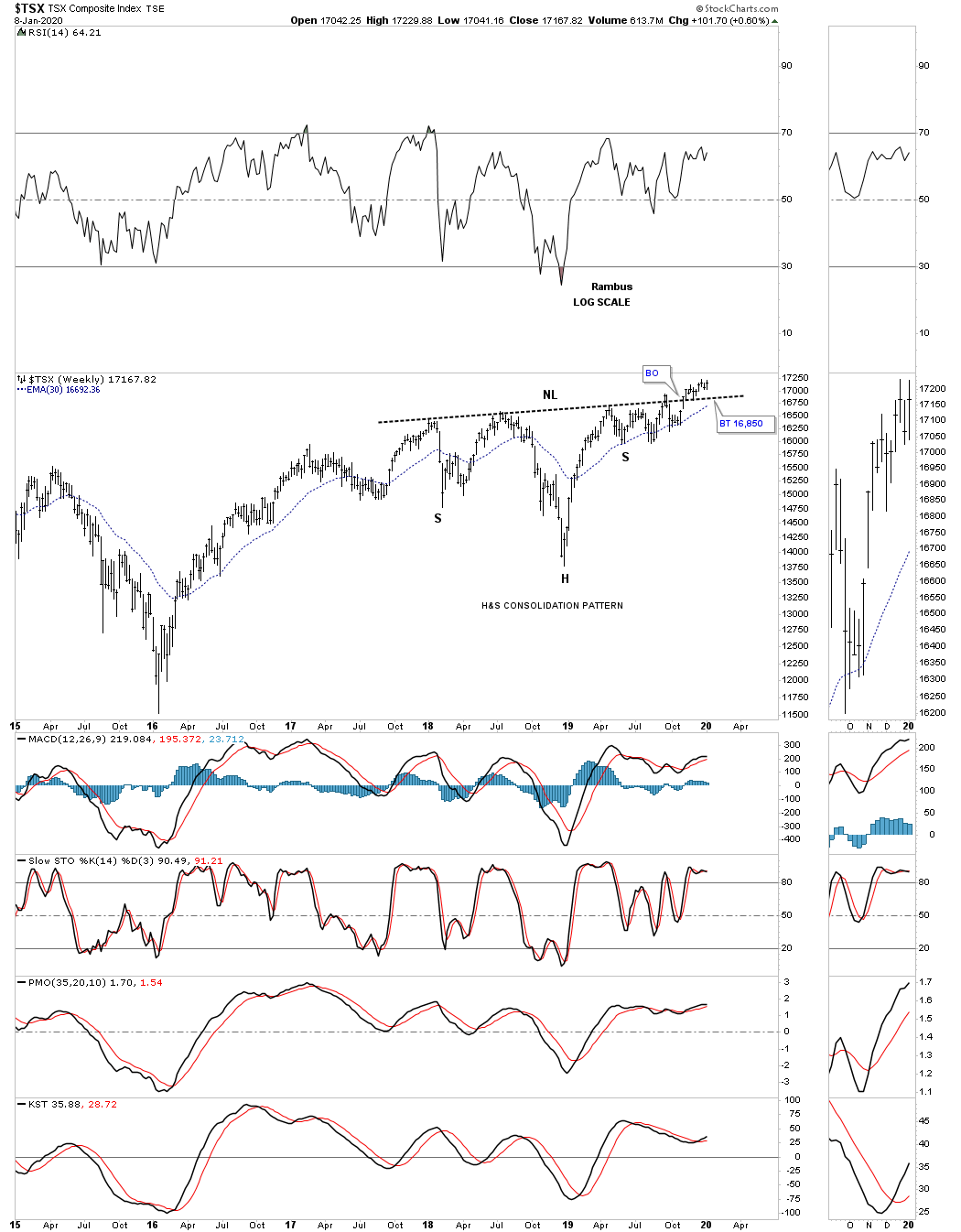
Below is the TSX, Canadian stock market, which I’ve tweak just a bit since the last time we looked at this long term monthly chart. As you can see the top rail is slightly rising which is creating a rising wedge formation. There is also the potential H&S bottom which is forming at the last reversal point in the 10 year bullish rising wedge which is currently breaking out into new all time highs.

This weekly chart shows the H&S consolidation pattern a little more clearly.
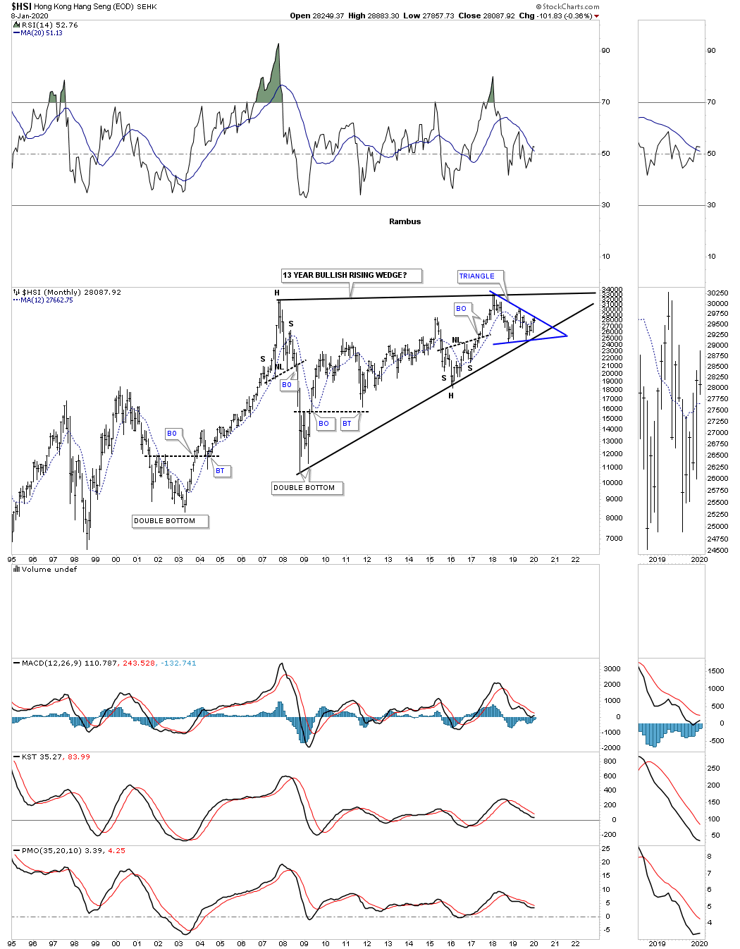
The $HSI, Hong Kong stock market, has been finding support on the bottom rail of the black 13 year rising wedge formation. In order to keep the 10 year triangle alive as a consolidation pattern the bottom rail needs to really hold support. A breakout above the top rail of the blue triangle would be a very bullish development.
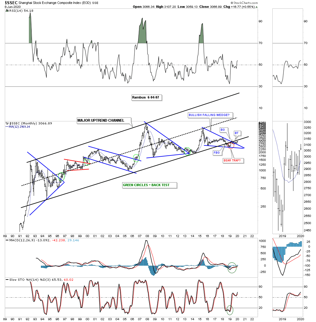
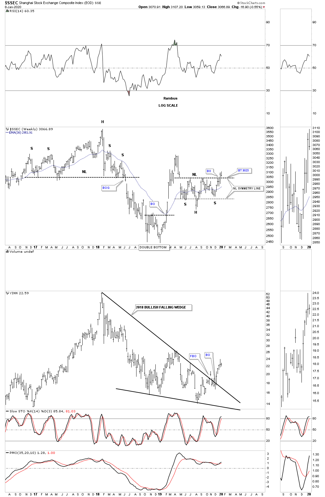
The SSEC, Shanghai stock market, broke out from its 2015 bullish falling wedge a year ago and has been in backtest mode since. The blue bullish falling wedge is just part of a much bigger 12 year triangle consolidation pattern.
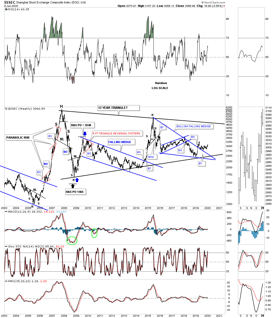
This old monthly chart shows the complete history for the SSEC going back 30 years. Note the blue bullish falling wedge that we just looked at on the daily chart above which is forming just above the bottom rail. As you can see there is a breakout below the bottom rail of the 30 year uptrend channel, labeled bear trap red circle, that may be in the process of being negated. If the SSEC can trade back above the bottom rail of the 30 year uptrend channel that would negate the breakout. Generally when we something like that it suggests we could see a strong move in the opposite direction, in this case up.
To show you why I think that could be the case is because of the H&S bottom that is forming on this 3 1/2 year weekly chart for the SSEC. We got the breakout last week with the backtest now underway this week.
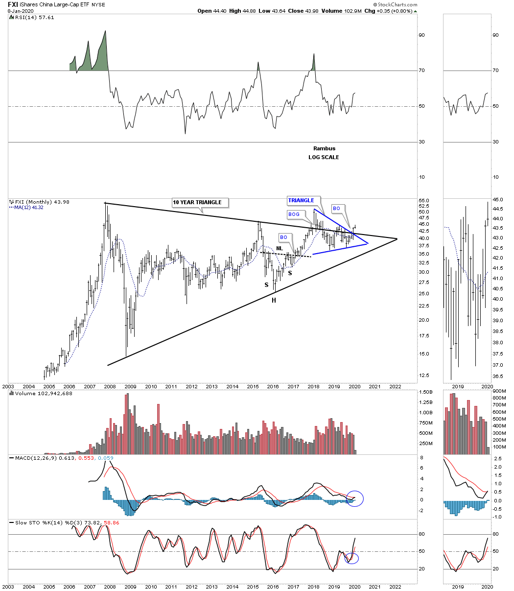
Next is the FXI, China large cap eft, which is building out a 10 year triangle trading range with a breakout above the top rail of the blue triangle and the top rail of the black 10 year triangle. What we have is the blue triangle forming right on the top rail of the 10 year triangle which can have a similar outcome as a consolidation pattern that forms just below an important trendline or one that forms just above the important trendline.
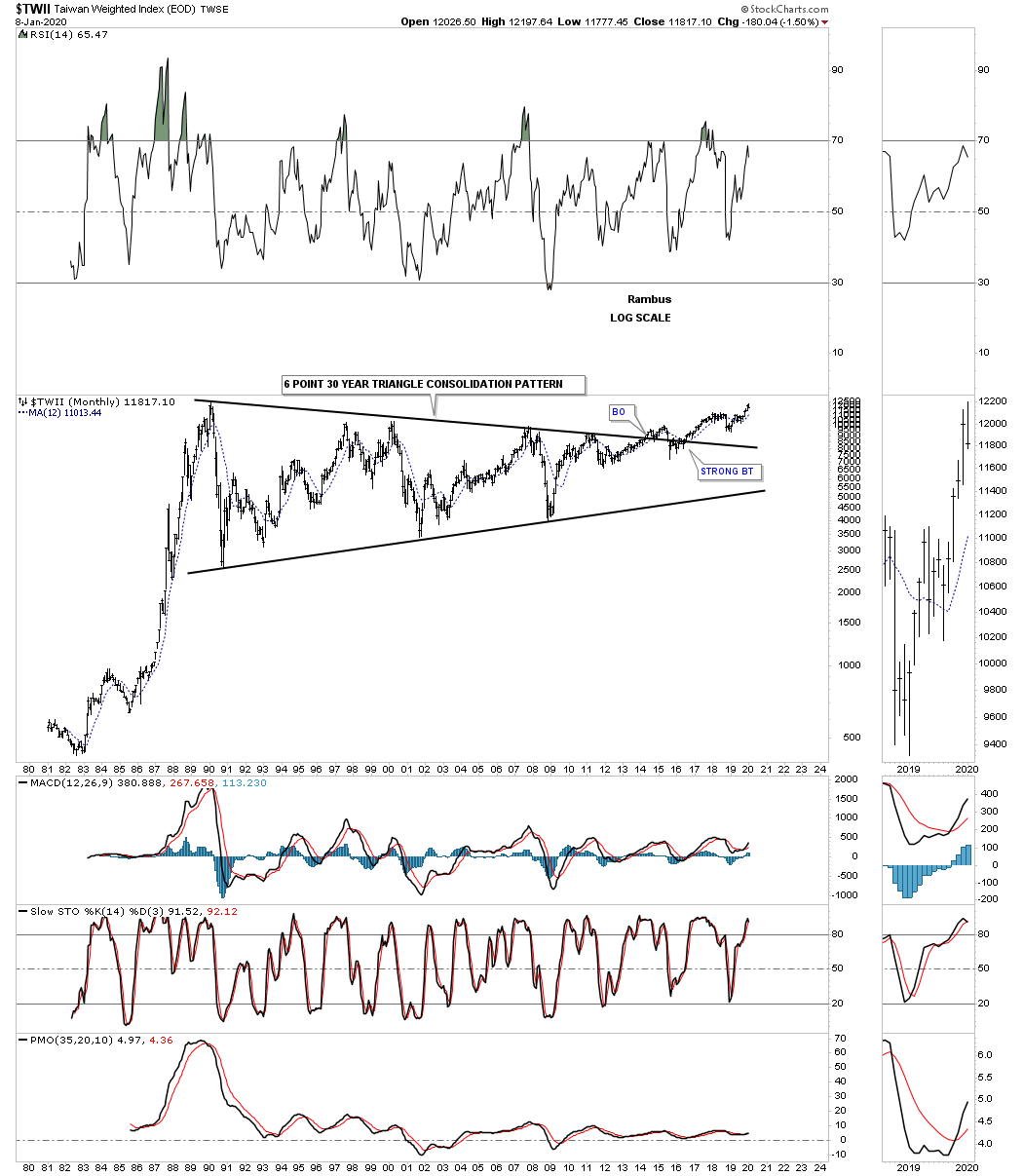
The $TWII, Taiwan stock market, has built out one of the largest consolidation patterns I’ve ever seen. After 30 years and six reversal points later the $TWII stock market finally broke out above the top rail in May of 2014. At this point I would like to see the all time high made back in February of 1990 taken out to add more confirmation the breakout is gaining traction. Getting close.
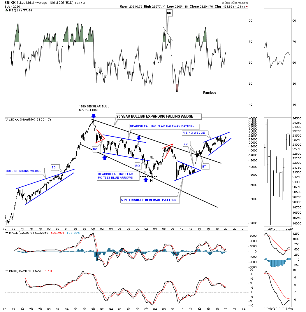
The $NIKK, Tokyo stock market, is setup much differently than many of the world stock markets we’ve reviewed. After its parabolic run Into its 1989 high it took 25 years to consolidate those massive gains forming a bullish expanding falling wedge. The price action is currently working on a four year rising wedge formation with a breakout above the top rail being very bullish if it happens. See the 1970’s rising wedge.
The EEM, emerging markets etf, built out a beautiful 10 year triangle consolidation pattern with a breakout and now the backtest underway which is still holding support.

The VEU, All world ex the US etf, has built out a beautiful 2009 bull market uptrend channel with the recent price action breaking out from the blue flag.

The AAXJ is an all Asian ex Japan etf, which shows it broke out from its six year bullish rising wedge with a backtest to the top rail about a year ago. Since the last Quarterly Report the price action has also broken out from the blue triangle consolidation pattern.

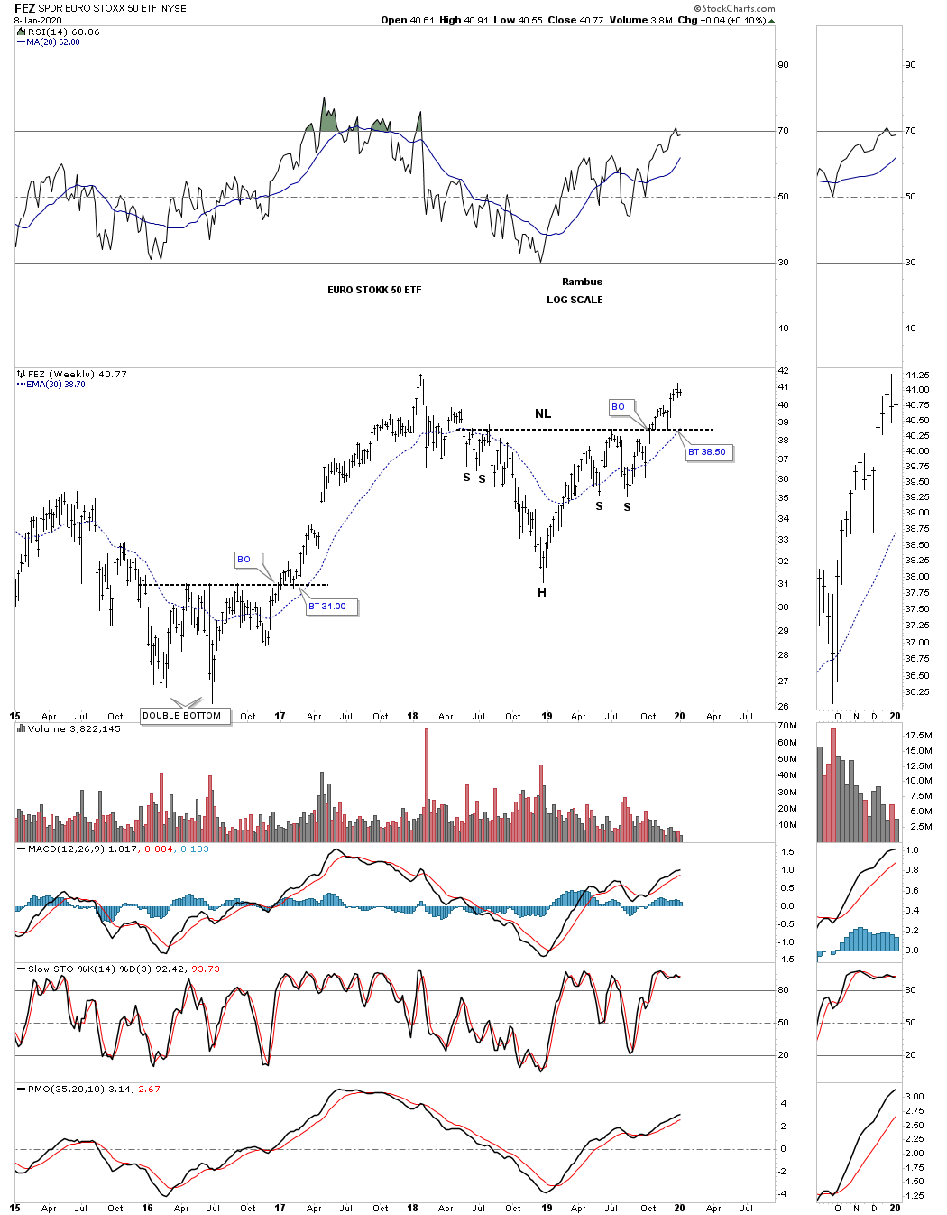
The FEZ is the EURO Stock 50 etf, which is showing a beautiful 2018 H&S consolidation pattern that matches many of the US stock markets 2018 H&S consolidation patterns.
This last chart for tonight is a weekly look at the ACWI, all world stock markets ex the US stock market, which is suggesting the rest of the world stock markets may not be as bearish as many think. This potential H&S consolidation pattern also shows up on some of the US stock markets as well. So far this is a very symmetrical H&S pattern that is building out. Since the last Quarterly Report the H&S neckline has given way completing the 2018 H&S consolidation pattern.
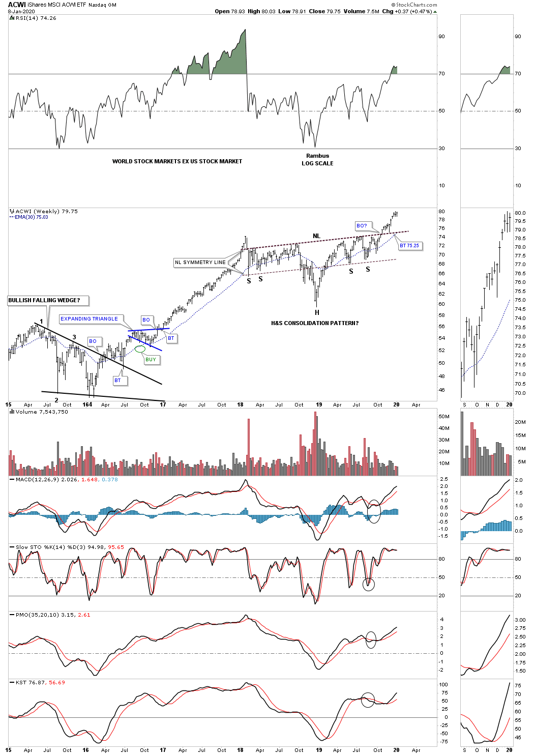
ACWI monthly H&S consolidation pattern in a string of consolidation patterns.

Maybe the fundamentals are suggesting the world is getting ready to crash and burn as so many analyst are suggesting. From a Chartology perspective maybe its a bit too early to expect the US and world stock markets to begin their new bear markets. After looking at all the charts above there is nothing in the charts that is suggesting the end of the world as we know it is upon us, but just the opposite. One day the end will come but for now enjoy the bull markets from around the world while they last. All the best…Rambus
Quarterly Report Part 3… Sectors Within The Stock Markets
In part 3 of this Quarterly report this is where we find out which areas within the markets have been doing the best or the worst. During a correction money tends to rotate from one area to another until each sector works on completing their consolidation phase. Some sectors will have a mild correction which is where the stronger stocks will be, while other sectors will experience a deeper correction which will shake many investors out of their shares.
One of the more dominate chart patterns we looked at in part 1 and part 2 of this Quarterly Report showed many 2018 H&S consolidation patterns which have broken out and are currently trading above their necklines. If we are seeing this pattern playing out in the US and world stock markets then the odds are high that we’ll see this same 2018 H&S consolidation pattern forming on many different areas within the US stock markets.
It’s the bullishness of these different sectors within the US stocks markets which gives me the confidence to strongly suggest the next impulse move higher has begun. Keep in mind it is the impulse move, after a consolidation phase, that you want to be fully invested. These types of impulse moves don’t come around very often, but maybe once or twice a year or less in which one can take advantage of what the markets are giving us. Most of the time the markets are in chopping mode which is confusing to both the bulls and bears alike.
Also what these big consolidation patterns give us is a very clean line in the sand in which to place your sell/stop. As long as the price action trades above the important top trendline of a consolidation pattern or neckline the stock or index is bullish and below is bearish. We can then use the 30 week ema and the 12 month sma as a simple trend following technique to help keep us in the impulse move. There will be news driven events or sharp shakeouts that will be short term in nature that will shake many investors out of their shares. My experience in the past has been that once you get shaken out of your positions, in a strong impulse move, you either stay out because you can’t find a place to get back in again or you bite the bullet and pay up to get your positions back.
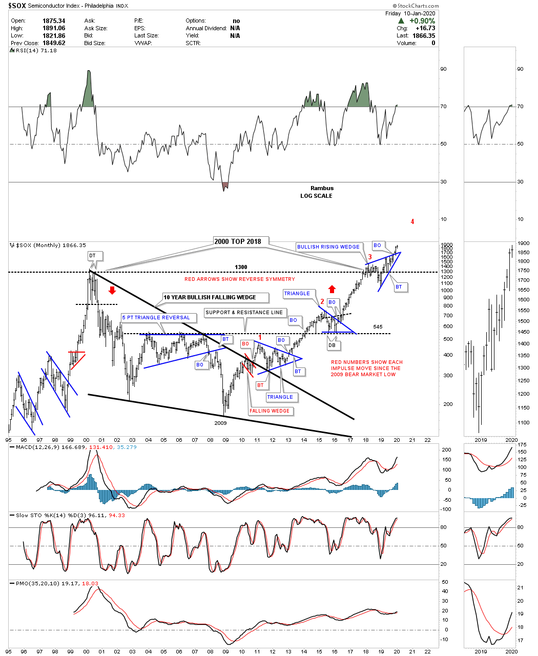
Lets start with one of the strongest areas within the stock markets which is the $SOX, semiconductor index, which is showing us a very bullish setup on this long term monthly chart. This monthly line chart shows the H&S bottom with a breakout above the neckline in the summer of 2016. That impulse move rallied high enough to take out the 2000 all time high and began to consolidate that impulse move by forming the bull bullish rising wedge right on top of the 2000 bull market trendline. That is classic Chartology. Then in November of last year just 2 months ago the SOX broke out from the blue bullish rising wedge and is now in its next impulse move higher. As I mentioned earlier the top rail of the blue bullish rising wedge can now be your line in the sand, bullish above or bearish below.
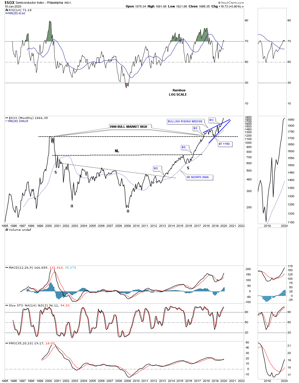
Below is a monthly bar chart for the SOX which shows you each impulse move starting at the 2009 bear market low followed by three blue consolidation patterns. As you can see the SOX is now trading into its fourth impulse leg higher since the 2009 low as shown by the red numbers.
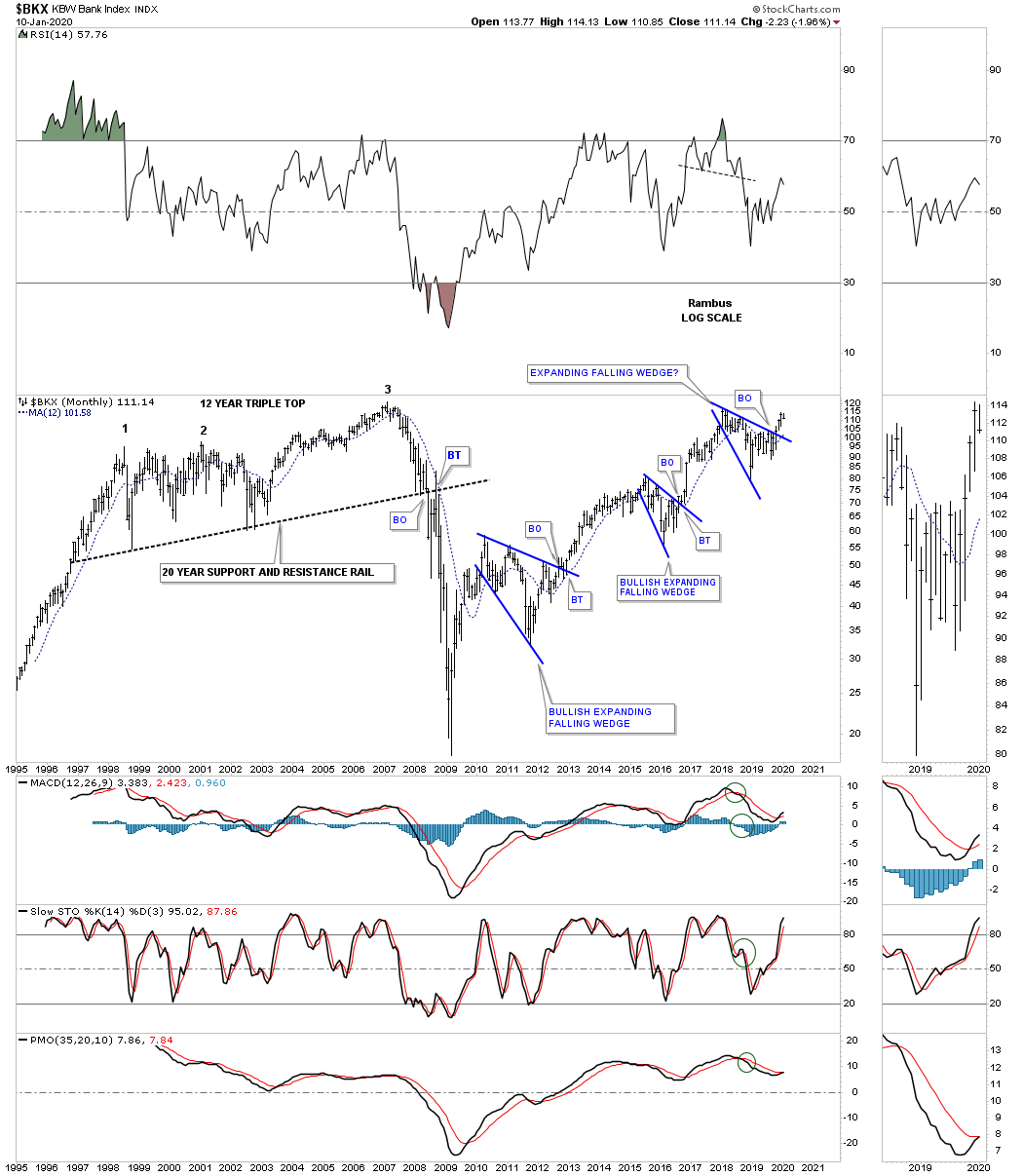
Next lets look at a couple if bank indexes which are showing very bullish characteristics starting with the $BKX, bank index. Since the 2009 bear market bottom this index has formed 3 bullish expanding falling wedges as its bull market consolidation patterns.
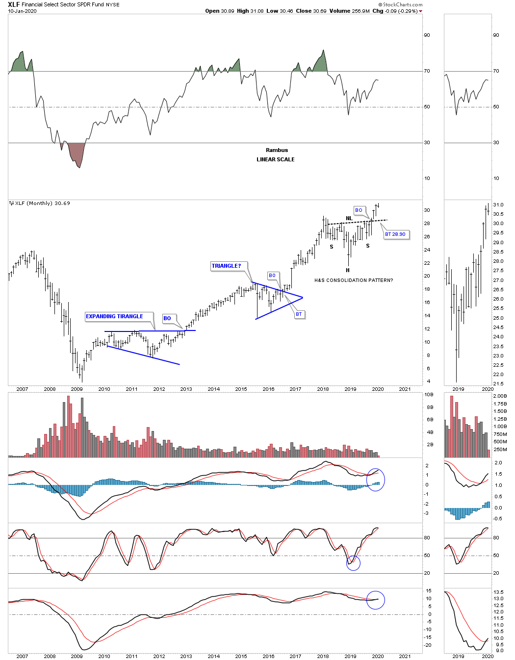
This next bank index we’ll look at is the XLF which shows a very symmetrical 2018 H&S consolidation pattern with the breakout above the neckline taking place in early November of last year. It’s still possible that we could see a backtest to the neckline around the 28.60 area which would represent a very low risk entry point for those looking to get positioned.
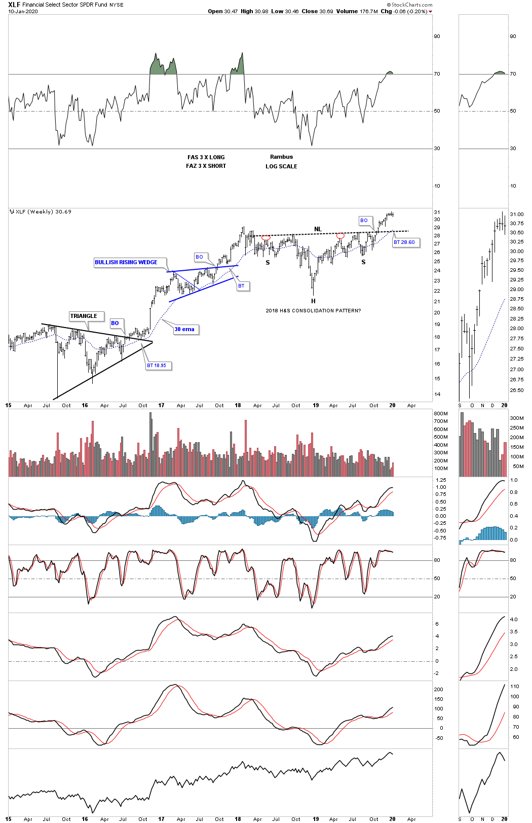
This long term monthly chart shows the 2009 bull market for the XLF.
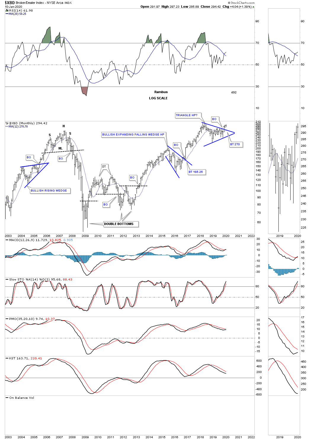
The $XBD, Broker & Dealer index, has just recently broken out from its 2018 blue triangle consolidation pattern. A backtest to the top rail would come into play around the 270 area if we get one.
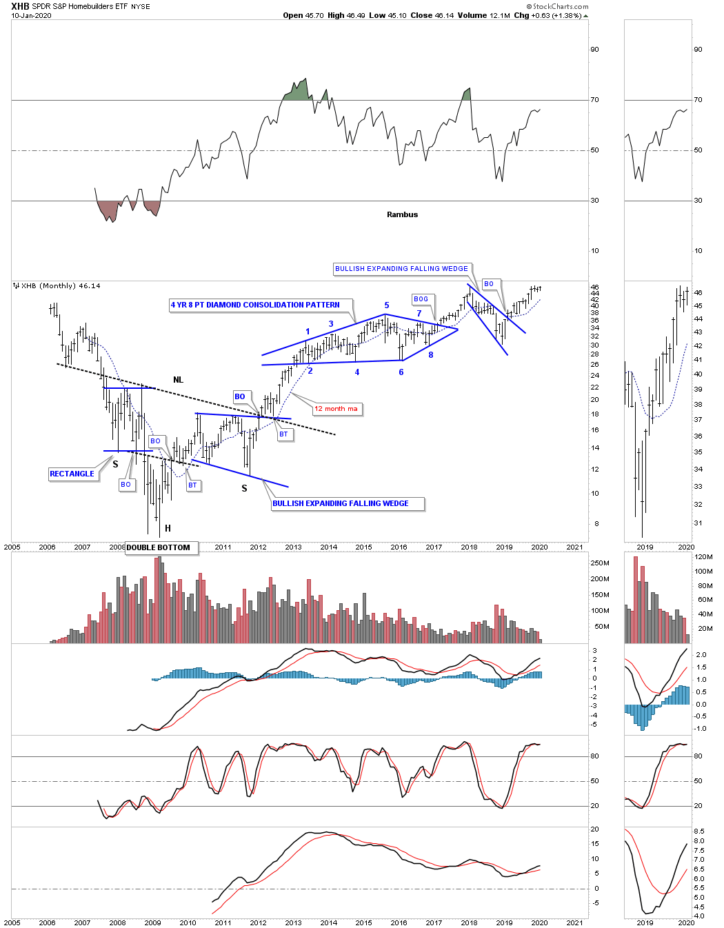
Another area we like to see doing good in a strong economy is the XHB, Homebuilders. After breaking out from its bullish expanding falling wedge back in February of 2019 the price action is now testing its all time highs made back in early January of 2018. Note the massive 5 year H&S bottom that formed from 2007 to early 2012 which launched the 2009 secular bull market which shows no signs of weakening yet.
Besides the Semiconductors being one of the strongest areas in the markets the biotechs are also one of the strongest sectors even though they haven’t broken out to new all time highs yet. What is so bullish about the biotechs is they are still building out a bullish rising wedge which began to form 5 years ago in August of 2015. In Chartology the saying goes, the bigger the consolidation pattern the bigger the impulse move. Note what happened when the top rail of the 10 year triangle gave way back in July of 2009. There is a very good chance that when our current 5 year bullish rising wedge completes its impulse move sometime in the future that it will show up as a halfway pattern between the breakout from the 10 year triangle to the next all time high down the road. The blue arrows show how the 10 year triangle formed as a halfway pattern using the impulse measured move method.
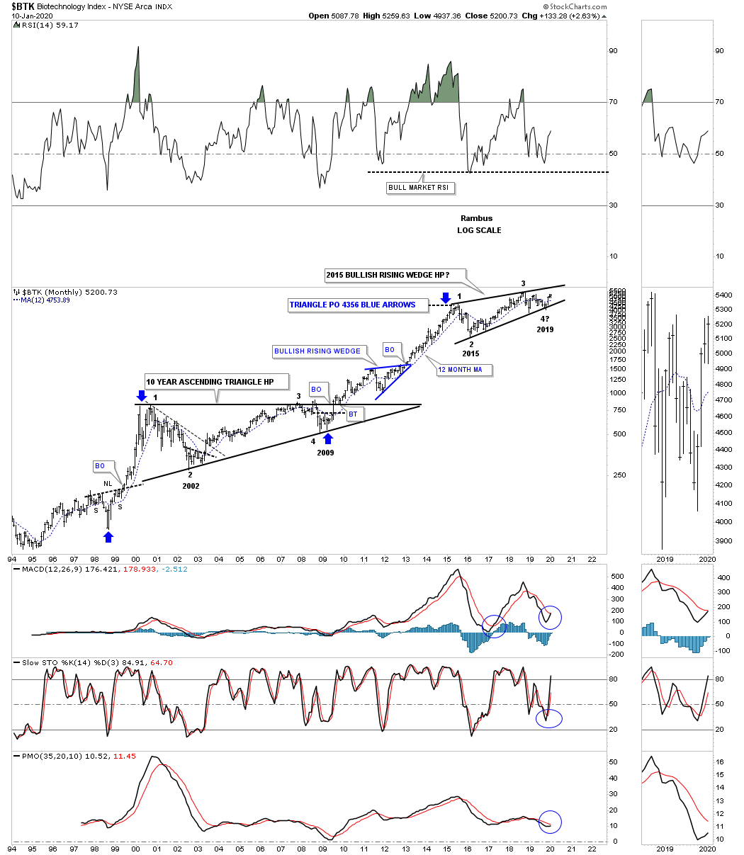
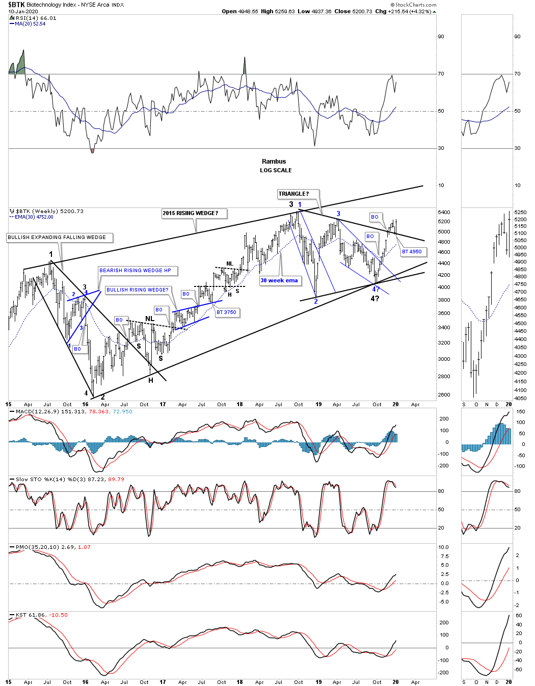
This weekly chart for the $BKX shows the internal structure of the 2015 rising wedge formation which is made up of many smaller chart patterns. Last week we were looking for a backtest to the top rail of the 2018 black triangle around the 4950 area which we got. The black 2018 triangle that has formed toward the apex of the 5 year rising wedge is strongly suggesting the breakout is going to happen to the upside because of its price objective which is well above the top rail of the 2015 rising wedge.
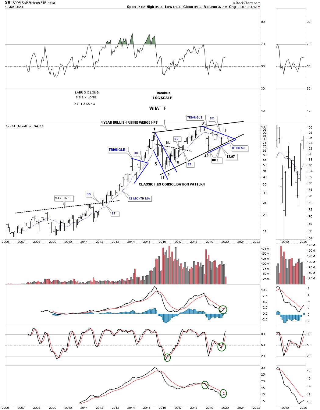
This last long term monthly chart for the biotech sector is the XBI which I use for trading the 3 X leveraged etf, LABU.
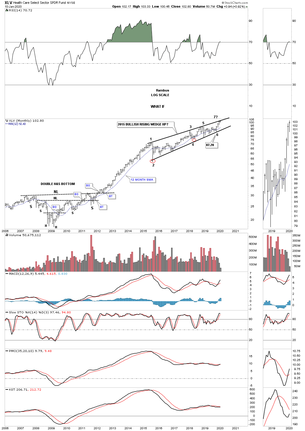
While we are looking at big consolidation patterns, below is another long term monthly chart for the XLV, Healthcare fund, which is showing a 5 year bullish expanding rising wedge formation. Last quarter when we looked at this monthly chart the price action was trading at the bottom rail at reversal point #6. At the end of the 4th quarter the price action traded all the way back up to the top rail where it has been digesting that last internal move higher completing the 6th reversal point. The last step in completing this 5 year expanding rising wedge will be when we see a breakout above the top rail. Again, note the large 5 year H&S bottom which led to the last impulse leg higher, up to reversal point #1 in the five year rising wedge, which I’ve labeled as a halfway pattern similar to what the BTK, biotech index is showing us.
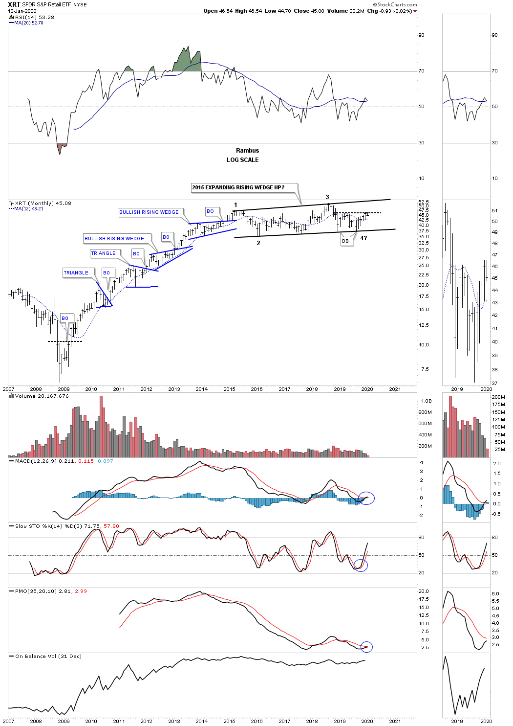
There is another sector that has been building a a very large 5 year consolidation pattern which is the XRT, Retail sector. Note the classic bull market from the 2009 low to the first reversal point in the 2015 expanding rising wedge, which formed one blue consolidation pattern on top of the previous one.
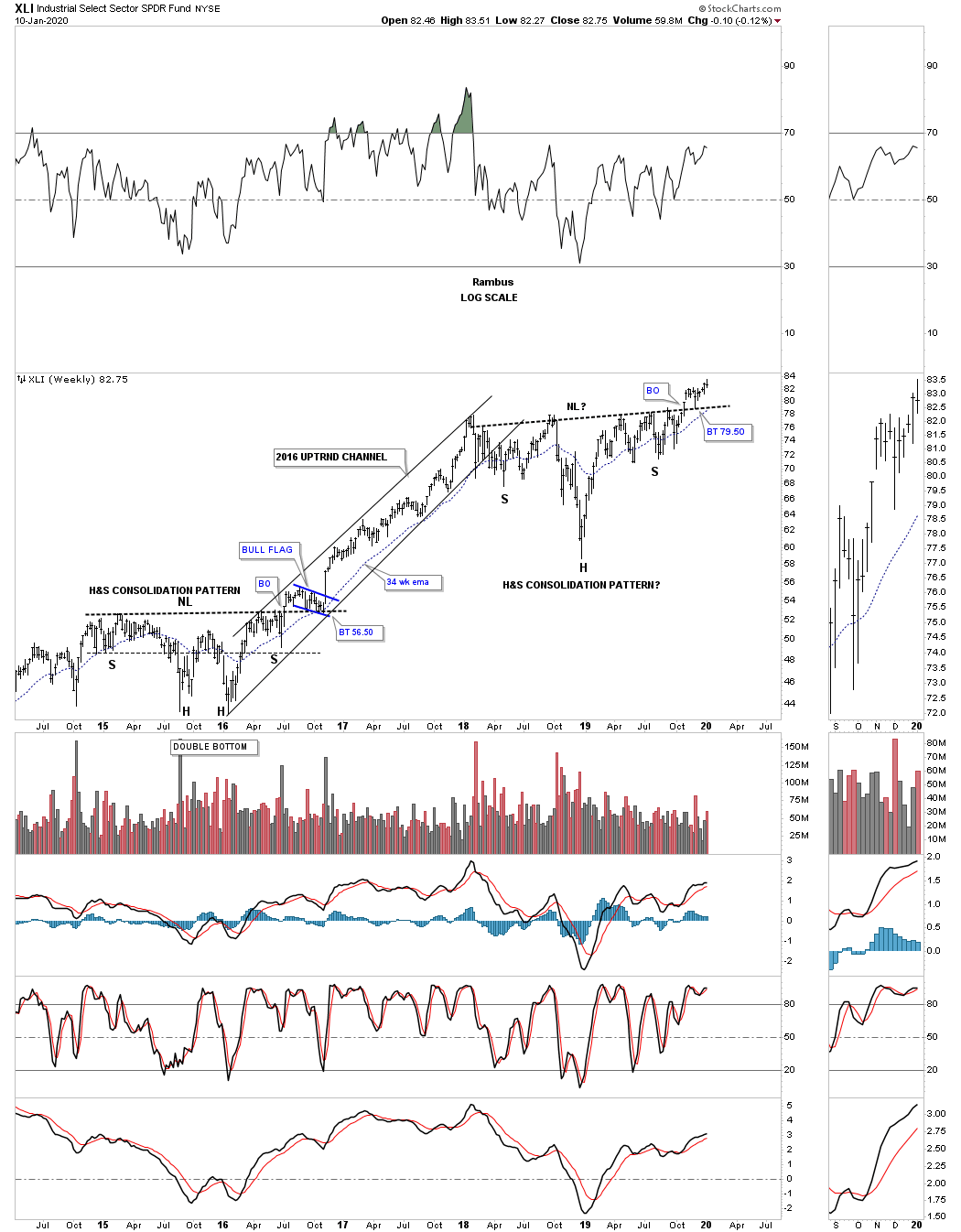
This next sector that we like to see help lead the bull market higher is the XLI, Industrial fund. Similar to many of the 2018 H&S consolidation patterns we’ve looked previously the XLI completed its own 2018 H&S consolidation pattern in early November just 2 1/2 months ago. Note how the 12 month sma has been holding support starting at the low for the right shoulder up to the present. This monthly chart also shows you a good example of what a bull market looks like with one consolidation pattern forming on top of the previous one with an impulse move in between.
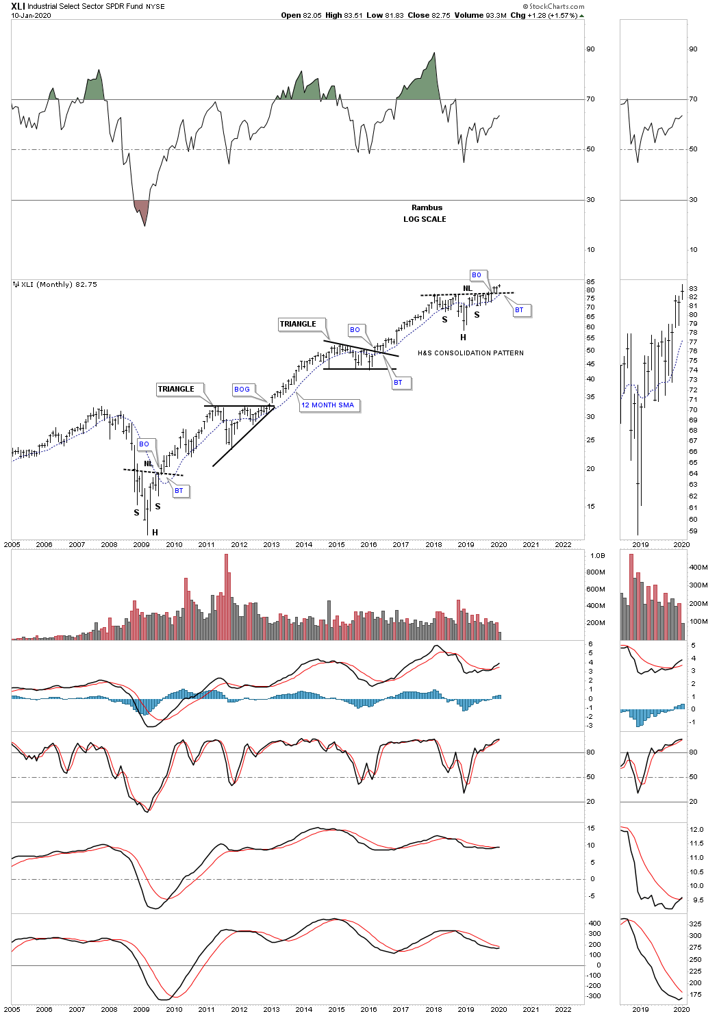
I would like to put into context why I think the 2018 H&S consolidation pattern will have a very bullish outcome. This daily chart below shows the 2018 H&S consolidation pattern with the backtest to the neckline being the smaller H&S consolidation pattern. Note how the head of the small H&S backtest found support right on the 2018 H&S neckline. As long as a pattern is working you stay with it until something breaks or changes.
XLI weekly chart for perspective.
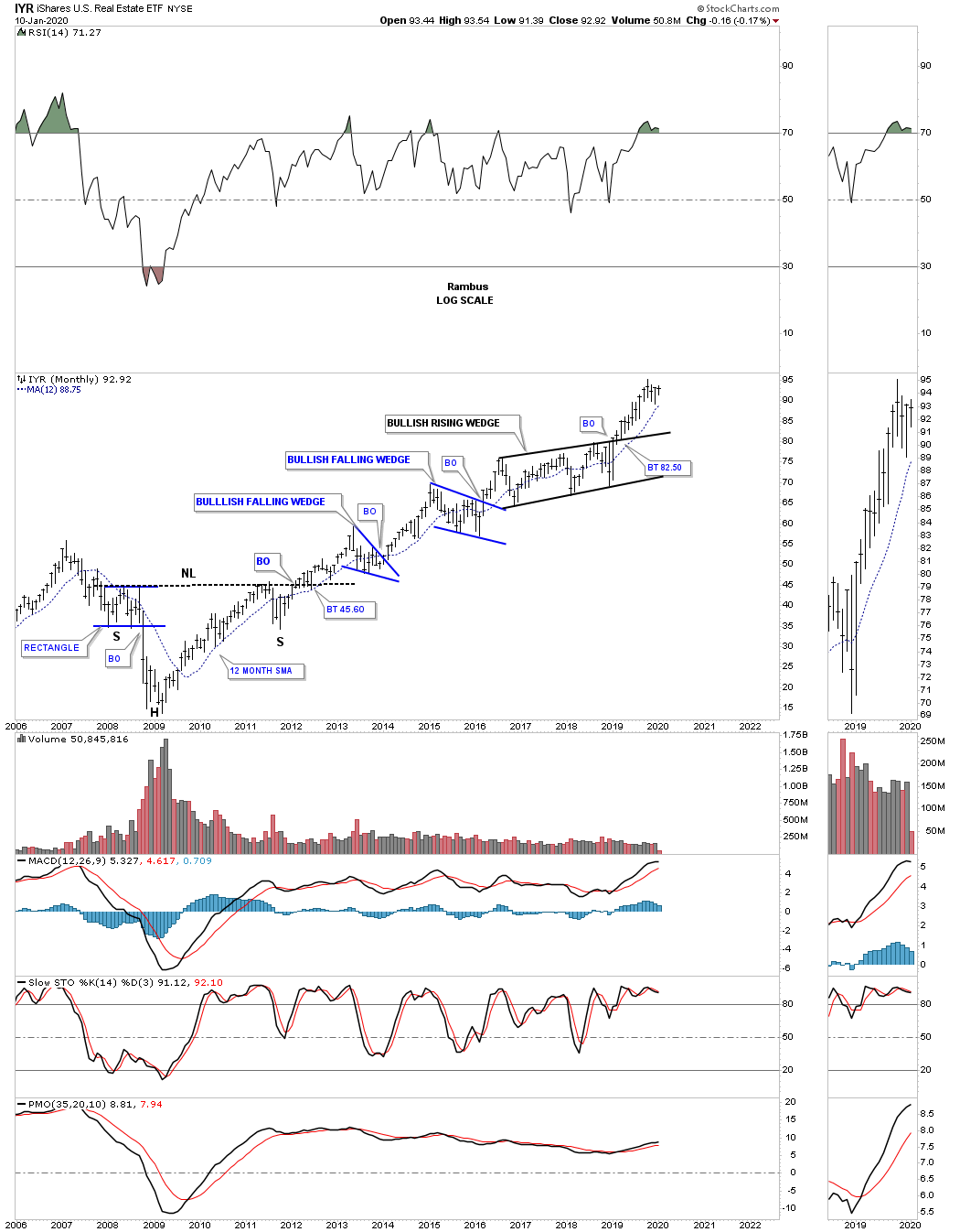
A bull market wouldn’t be a bull market unless the IYR, Real Estate etf, can participate. For those that are wondering why I’ve been calling many of the rising wedges and flags as bullish even though they haven’t broken out yet is because there are other areas that have broken out of their respective bullish rising flags or wedges. This monthly chart for the IYR shows it broke out from its 2016 bullish rising flag in February of 2019 a full 9 months before many of the other sectors we’ve looked at in this Quarterly Report. Again note the massive H&S bottom that reversed the 2008 crash into the current 2009 secular bull market.
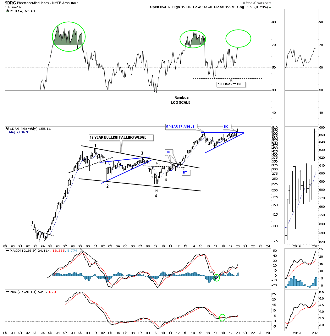
Another area that has just recently broken out of its own 5 year triangle consolidation pattern is the $DRG, Pharmaceutical index, even with all the negative news on lowering drug prices. The last Quarterly Report showed the price action trading on the bottom rail of that blue 5 year triangle. Note the H&S bottom that formed at the 4th reversal point in the 12 year bullish falling wedge which strongly suggested at the time that the massive consolidation pattern was coming to an end.
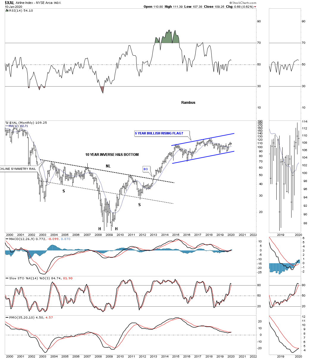
Another area that has been building out a 5 year consolidation pattern is the $XAL, Airline index. Note the impulse move that took place when the massive 10 year H&S bottom finally completed. Since that initial impulse move ended the XAL has been woking on the 2015 rising flag formation.
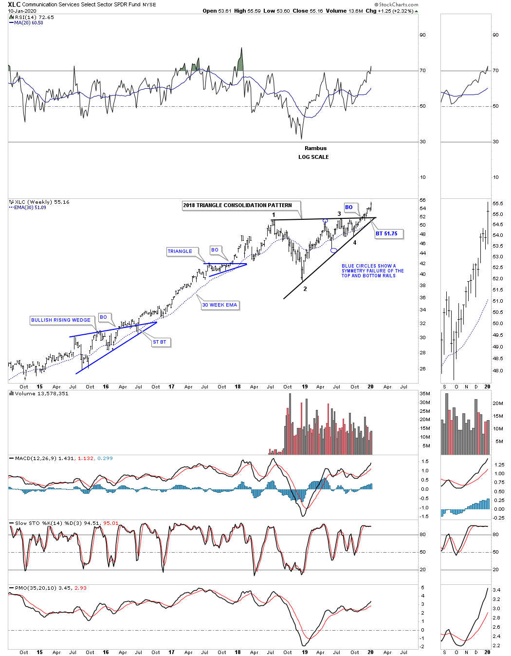
This last chart we’ll look at tonight is a 6 year weekly chart for the XLC, Communiction Fund, which is another index that has recently broken out from its 2018 triangle consolidation pattern. This index consists of many large cap stocks such as FB, GOOGL, NFLX and DIS to name just a few.
If there was ever a time to be fully invested in the stock markets now is as good a time as any to play the impulse move. Strong impulse moves take place after an extended consolidation phase or reversal pattern is completed. Most investors that do good during an impulse move, but don’t understand what is taking place, will give back a large portion of their gains during the next consolidation phase. It is just how markets work. There is a time to be in and a time to be out unless one is a very long term investor in which you ride out all the consolidation patterns that can last several years or longer as we’ve seen from the charts above.
In part 4 of this Quarterly Report we’ll look at the PM complex which has been consolidating its previous impulse move higher.
Have a great rest of the Weekend and all the best…Rambus
Quarterly Report Part 4… Precious Metals Complex
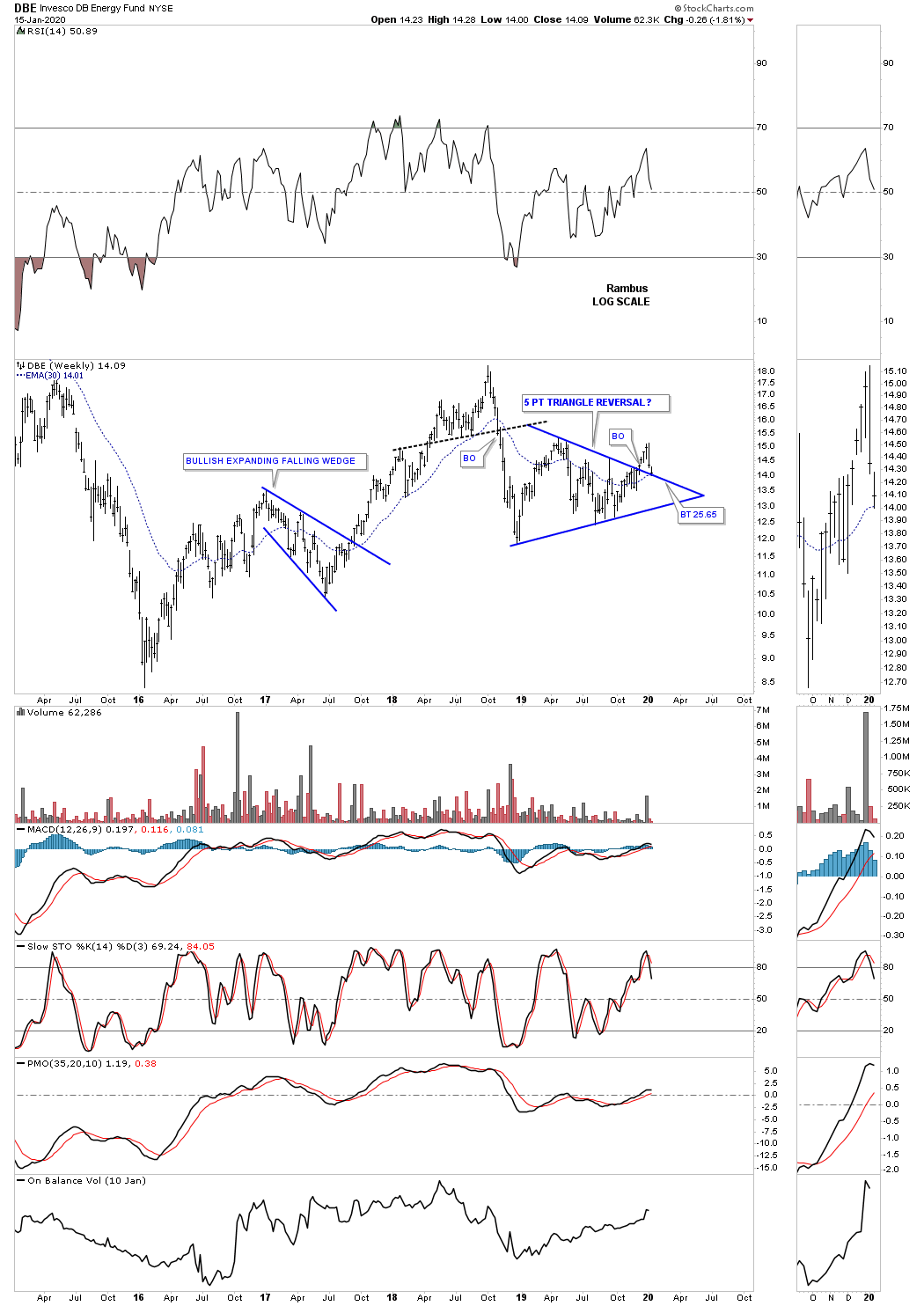
In part 4 of this Quarterly Report we’ll take a look at the precious metals complex which formed its bear market low in January of 2016. Since that important low the PM complex enjoyed a massive impulse leg up into the August 2016 high which ushered in the first consolidation phase which ended up being the 2 1/2 year bullish falling wedge. The breakout from that 2016 bullish falling wedge took place one year ago in January of 2019 which led to the 2nd impulse leg up which ended in August of 2019. From that high the PM complex has been forming its next potential consolidation pattern which is currently under construction.
Before we look at the 4th Quarterly Report combo chart for the PM complex I would like to show you the same monthly chart we looked at the end of the first Quarterly Report so you can see the progression of the bull market.
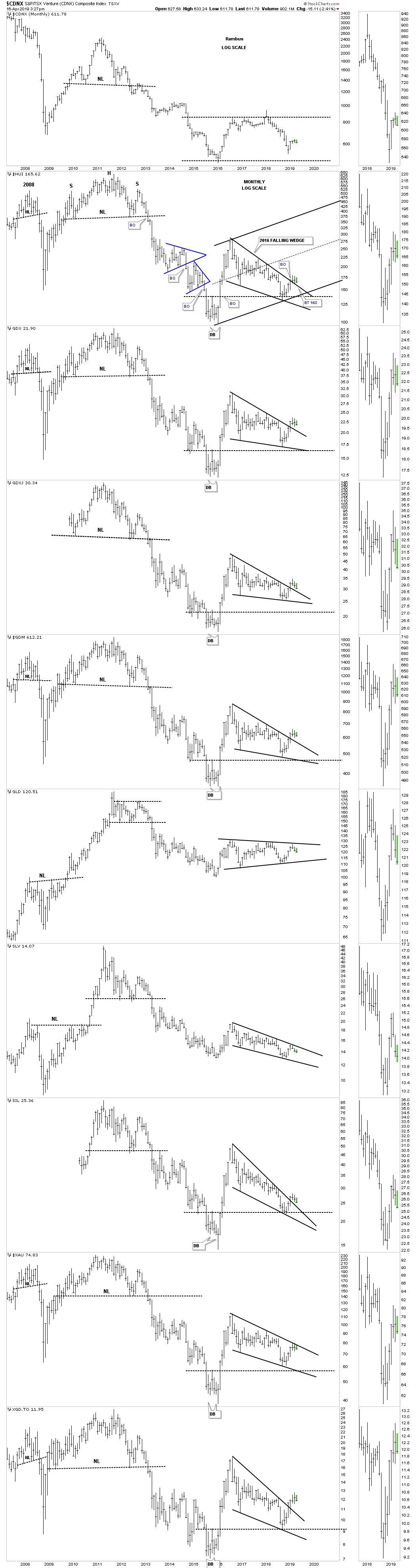
Below is the same chart as the monthly chart above which shows how the bull market has been building out over the last year. I’ve used up all my annotations allowed by Stock Charts so you can use the $HUI as a proxy for the other charts and how they should look.
First, notice the 2016 bullish falling wedge on the HUI chart which still remains in place since the first Quarterly Report. The current price action is building out a possible small blue bullish rising wedge just below the center dashed midline. The GDX just below the HUI is also forming a small blue consolidation pattern that may end up being a flag depending on where the last reversal point forms. To keep the bull market going we will need to see new highs taking out the previous highs which is not far away for most of the indexes.
In a Late Friday Night Chart I showed you this Quarterly Chart for gold going back to the beginning of the bull market in 2000. I made the comparison to our current multi year H&S consolidation pattern to the 2000 multi year double bottom reversal pattern. We specifically looked at the 3 quarterly bars that show the breaking out and backtesting phase to the double bottom trendline in 2002. We then compared that 3 quarter bar breakout phase to our current breaking out and backtesting phase that is currently underway. The reason I showed you that quarterly chart was so you could see the backtest to the neckline around the 1350 area which would be perfectly normal and should be expected to finish up all the work to launch the next impulse move higher, but there is no rule that we have to have a backtest.
Before we move on I want to make a very important point right here on how important that 6 year H&S neckline is that comes into play around the 1350 area. That is my line in the sand, above the neckline is bullish and below is bearish. A failure of that neckline to hold support on a possible backtest would be totally unacceptable for any reason. It seems like a given that the current leg up in golds bull market is 100% guaranteed, but there are no absolutes when it comes to the markets, odds yes but no absolutes.
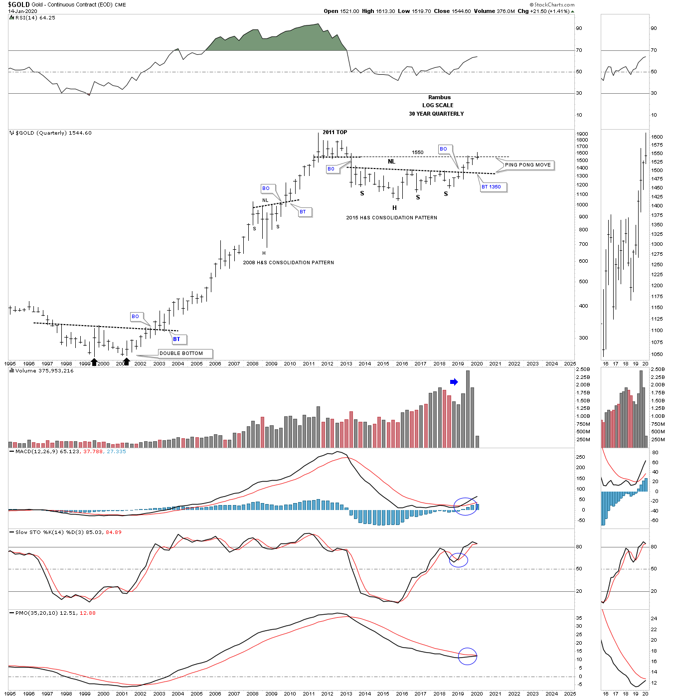
Back in 2008 gold built out a beautiful and symmetrical H&S consolidation pattern that reversed the crash which doesn’t look all that impressive now, but at the time it was pretty dramatic. Since 2013 or so gold has built out another very symmetrical H&S consolidation pattern that had its breakout 7 months ago in June of 2019. Again, a backtest to the neckline would come into play around the 1350 area but there is no law that says we have to have one. Either way the neckline is our line in the sand above is bullish and below is bearish. One last point to make on this monthly chart for gold is that gold has made a new bull market high this month which is what we want to see even though it’s a modest new high.
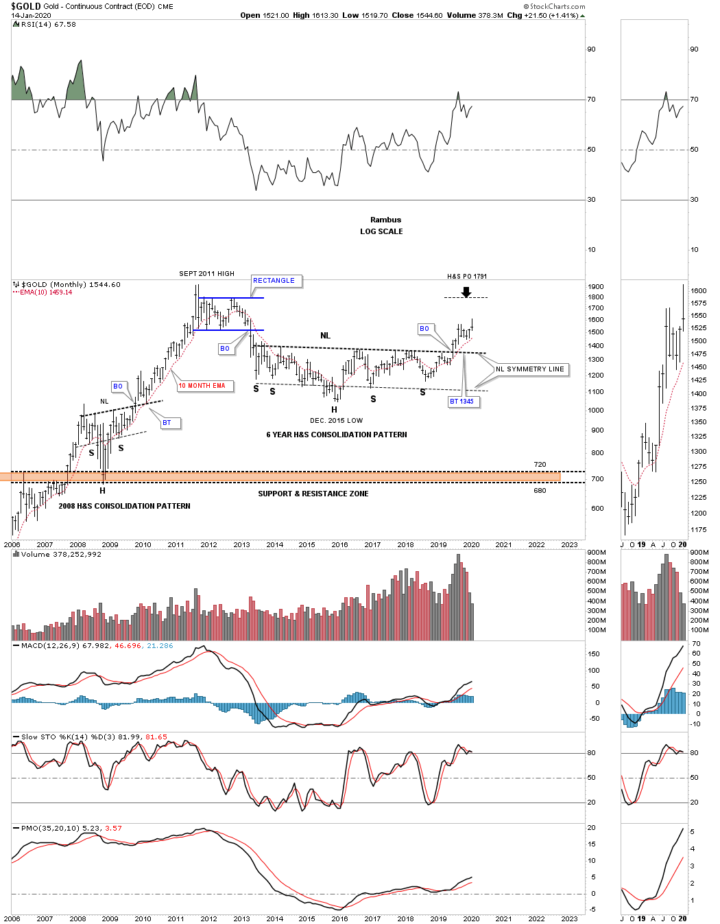
Gold’s 10 year bull market was so strong that it produced a parabolic arc that was finally broken during the formation of the 6 point blue rectangle at the all time high area. Some of you may remember when I suggested we could see a ping pong move between the 2015 H&S neckline and the bottom rail of the major uptrend channel before the neckline finally gave way. There were many touches of the neckline that started to form all the way back to the middle of 2013 from below that should now reverse its role to support. Investors who bought gold below the neckline are still holding on to a profit and will hold tight unless the neckline gives way. That’s the simple psychology of how a support and resistance zone works.

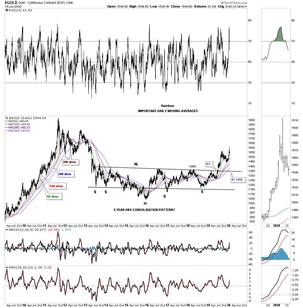
Durning the bull market years in gold I used a ribbon of daily moving averages that showed the angle of the bull market. Since the breakout above the 2013 H&S neckline those same moving averages are now becoming properly aligned once again. What we want to see is the 50 day sma trading above the 150 day sma with the 200 day sma trading above the 300 day sma. The 300 day sma did a really good job of holding long term support with the 150 day sma holding intermediate term support.
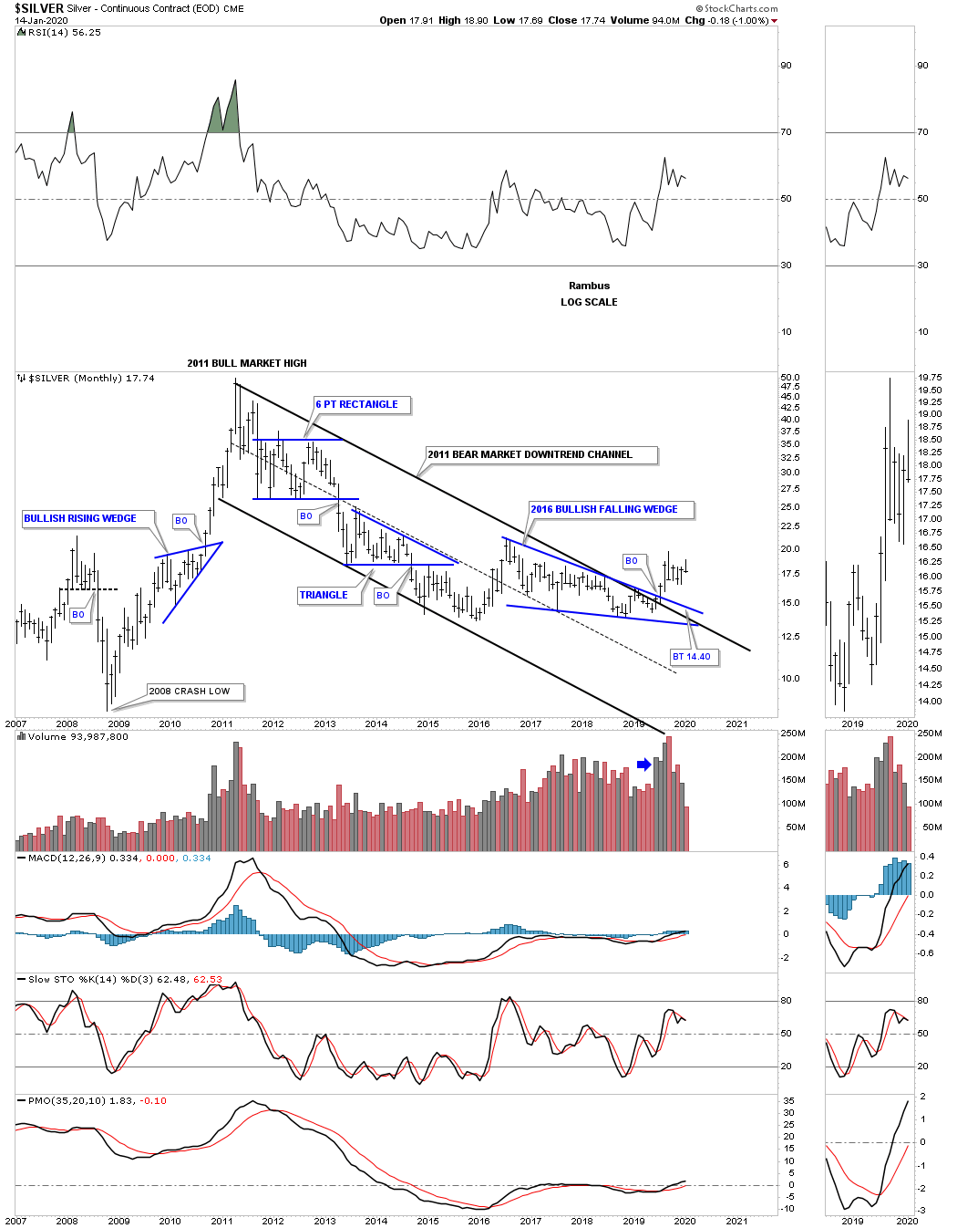
Below is a long term monthly chart for Silver which shows its 2011 bear market downtrend channel and the 2016 bullish falling wedge. Back in July of 2019 the price action broke out of both the top rails of the 2011 bear market downtrend channel and the top rail of its 2016 bullish falling wedge reversing the bear market to a bull market.
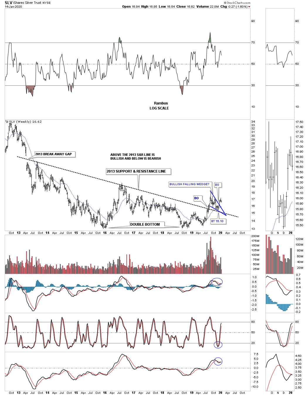
This next chart is a 7 1/2 year weekly chart for SLV which shows a very bullish setup. All the way back in 2013 the SLV and most of the PM complex formed a massive breakaway gap that basically launched the bear market. I knew at some point in the future that big gap may come into play. Whenever I draw in a trendline I like to look for a minor high or low or a gap in which to begin the trendline. I’ve labeled the 2013 trendline as a support and resistance line, above is bullish and below is bearish. Five months ago in August of 2019 the price action broke out above the 2013 S&R line creating a bullish breakout. After the initial rally stalled out above the 2013 support and resistance line SLV has formed the blue bullish falling wedge as the backtest.
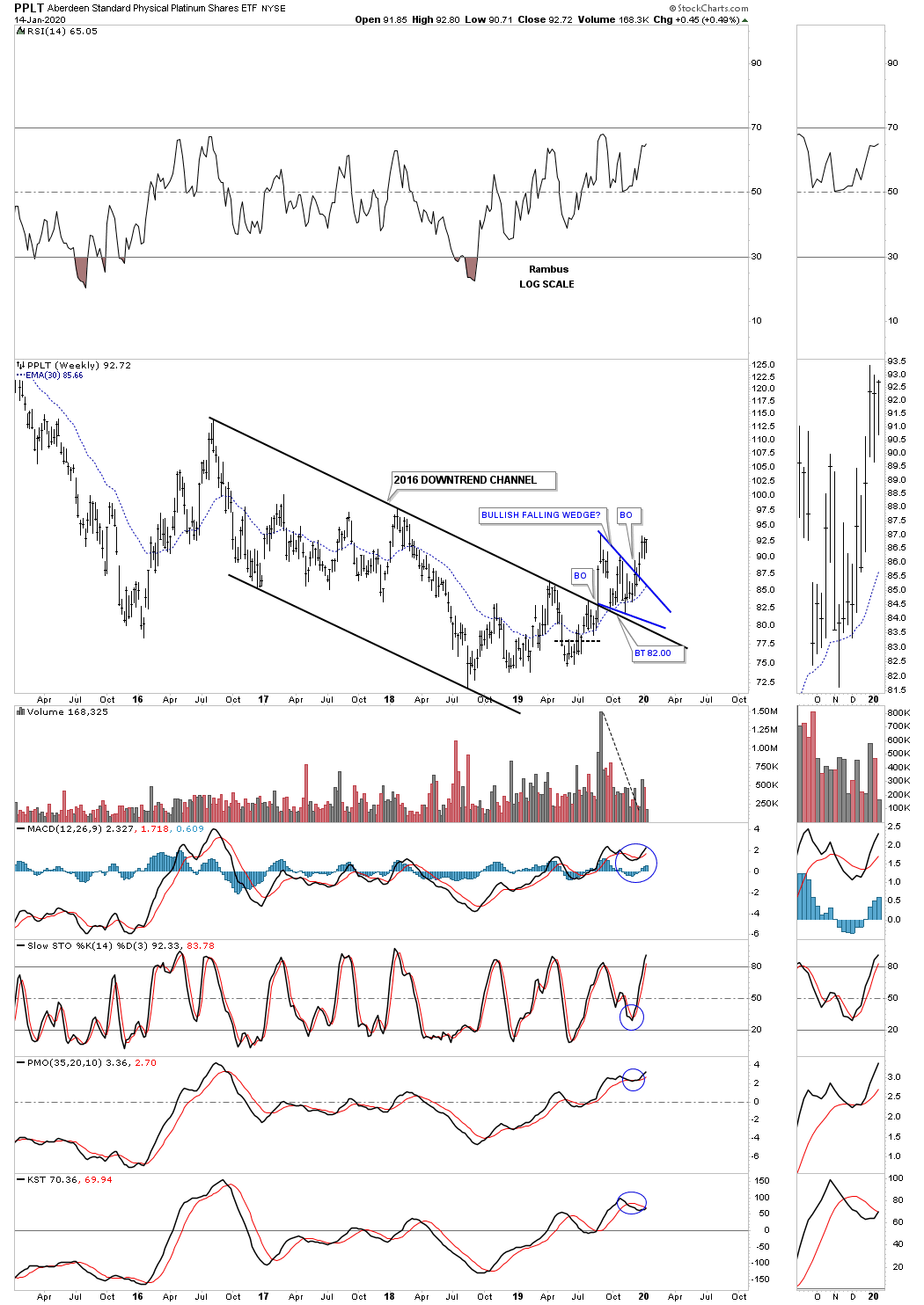
Below is a weekly bar chart for PPLT, platinum, which broke out from its 2016 bullish falling wedge in August of 2019 and is getting close to taking out the previous high of the blue bullish falling wedge which will be very bullish.
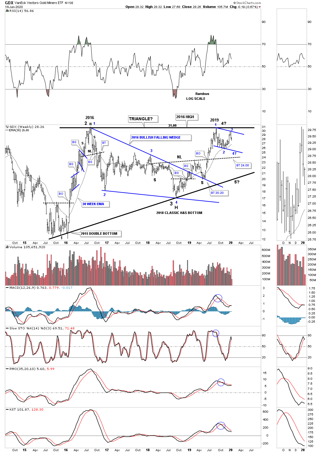
This last chart for the PM complex shows all the different chart patterns that have formed since the 2016 bear market low on the GDX. First you can see the 6 month double bottom that formed the actual bear market low. Once the double bottom trendline gave way the GDX made a beeline up to the August 2016 high. At the August 2016 high, labeled with the black #2, the GDX built out the 2016 bullish falling wedge which lasted exactly 2 years at black reversal point #3. The price action then rallied to takeout the top rail of the blue 2016 bullish falling wedge with a clean breakout and backtest to the top rail. After the backtest was completed at 20.20 the next impulse leg up began which took the GDX up to the recent high made in August of 2019 and the August 2016 high.
Before we move on I would like to point out the beautiful 18 month classic H&S bottom which formed at the 4th reversal point in the 2016 bullish falling wedge and at the possible 4th reversal point in the 2016 black triangle. Why I call that 18 month H&S consolidation pattern classic is because the right shoulder and head formed inside of the 2016 bullish falling wedge with the right shoulder low forming as the backtest to the to the top rail of the blue 2016 bullish falling wedge.
The GDX is now trading at a most critical area on this 5 1/2 year weekly chart. Back in September of 2019 the price action rallied all the way up to the previous high made back in August of 2016. Whenever a stock trades up to an old important high there is usually a pause where a small consolidation pattern may buildout just below that important trendline before the actual breakout occurs. If the price action fails to takeout that important old high trendline it could setup a move back to the bottom of the trading range. As you can see there is a possible blue flag forming just below the top rail of the potential black triangle. We still need to see a 4th reversal point form on the blue flag for it to be a consolidation pattern. For the time being I’m using a parallel upper and lower trendline for the potential blue bull flag because we still don’t have that important 4th reversal point in place yet. Depending on exactly where the possible 4th reversal point forms on the blue trading range we could see a triangle as the small consolidation pattern just below the recent high, if it forms above reversal point #2.
In part 5 of this Quarterly Report we’ll look at some odds and ends like commodities, currencies and interest rates. All the best…Rambus
Quarterly Report Part 5… Odds and Ends
Tonight we’ll look at commodities, currencies and interest rates to finish up the Quarterly Report for 2019. Commodities in general have begun to turn the corner which has been a long time coming. The US dollar has been in a slow steady rise since August of 2018 and could be building out a top that has yet to be confirmed while interest rates have been chopping sideways for the most part.
Lets start with the commodities complex which has been showing some strength recently for the first time is a long while. Reversing a strong downtrend to an uptrend takes a lot of work, but once the corner is turned a good move should follow.
The first commodity index we’ll look at is the $CRB index, which has been around a long time. This daily chart shows a H&S bottom with a breakout above the neckline and a backtest in progress to the 180 area.
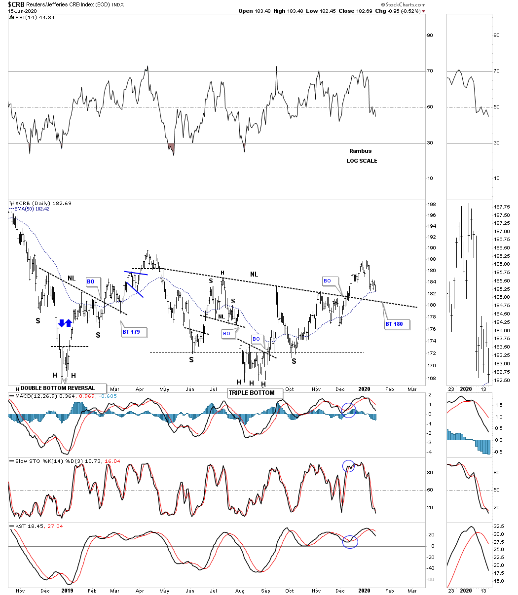
The CRB index has been trending lower for quite some time finally finding support at the 2016 low. For over 4 years now the price action has been building out a rising flag formation which still has some work to do, but with the H&S bottom, that we just looked at on the daily chart above, should be able to make it back to the top rail of the rising flag formation at a minimum.

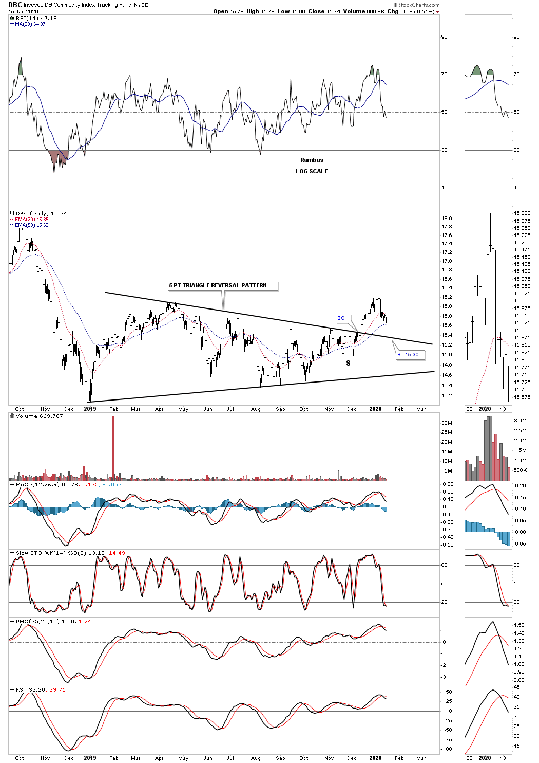
The DBC is a more actively traded commodities index which is showing a 5 point triangle reversal pattern in play with a complete backtest to the top rail around the 15.30 area.
The DBA, agriculture fund, has probably been the weakest area in the commodities complex. The price action is currently trading just above its all time low. It will be interesting to see if this recent low is going to be,”The Low,” for this cycle.

Next is a 5 point triangle reversal pattern which is reversing the shallow downtrend. The backtest to the top rail of the possible 5 point triangle reversal pattern is now in play and needs to hold support.
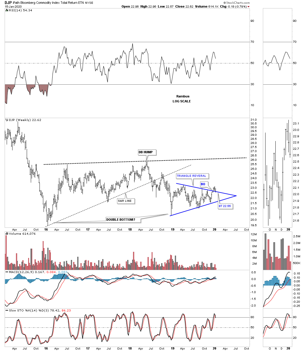
The DJP, Bloomberg Commodity index, is another 5 point triangle reversal pattern that needs to hold support on the backtest to the top rail of its triangle reversal pattern.
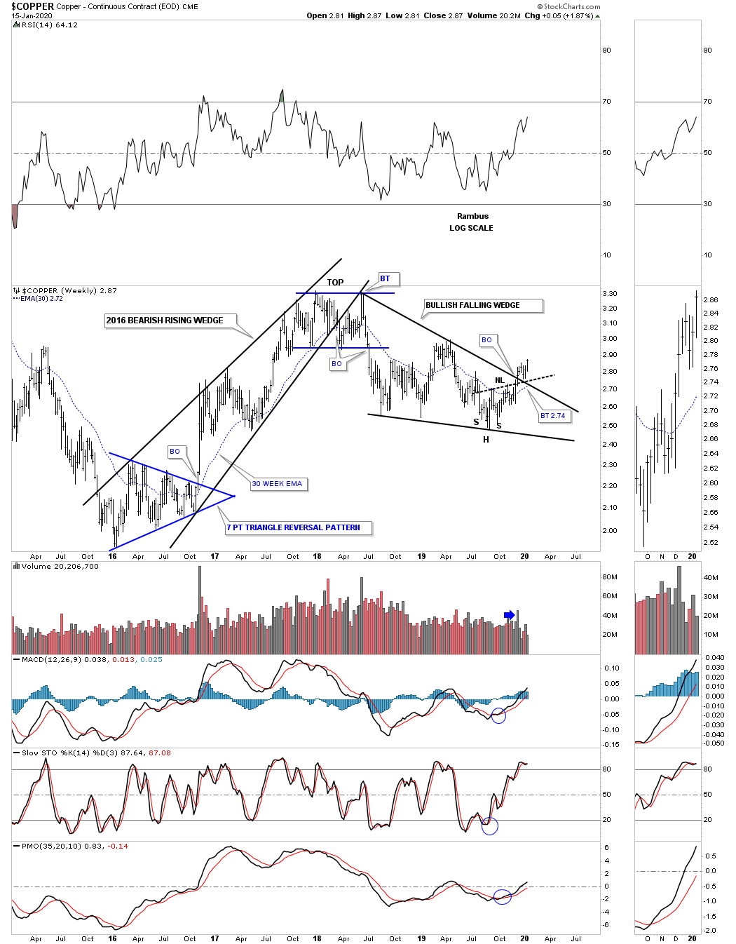
This daily chart for copper shows it is turning the corner with the completion of a 10 month H&S bottom.

This weekly chart for the CRB index shows a beautiful 2018 bullish falling wedge with the H&S bottom forming at the last reversal point.
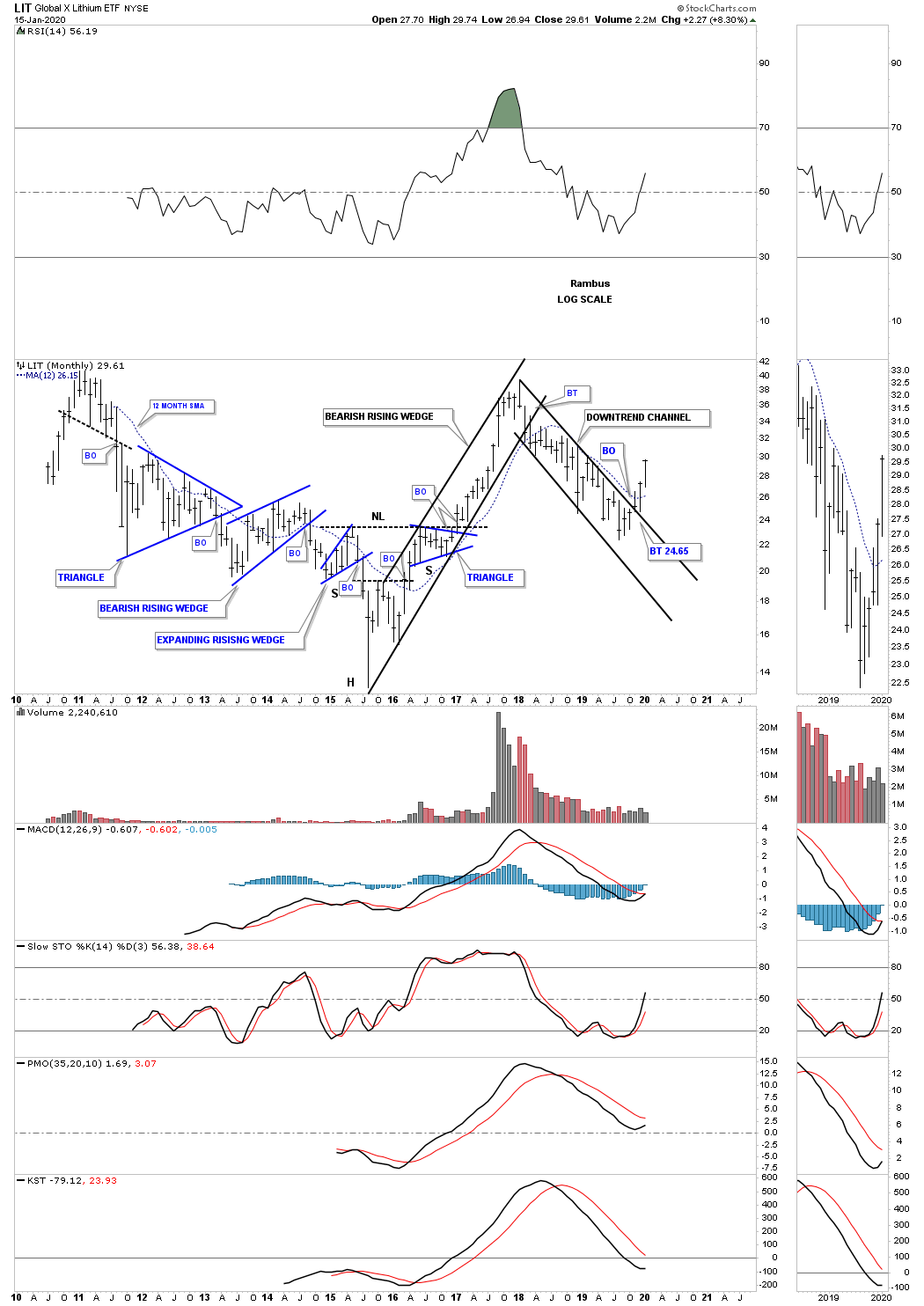
Next is a weekly chart for the LIT, Lithium etf, which has formed a classic H&S bottom with the right shoulder and head forming inside of the bullish falling wedge with the right shoulder low forming on the backtest to the top rail.

The long term monthly chart for the LIT.
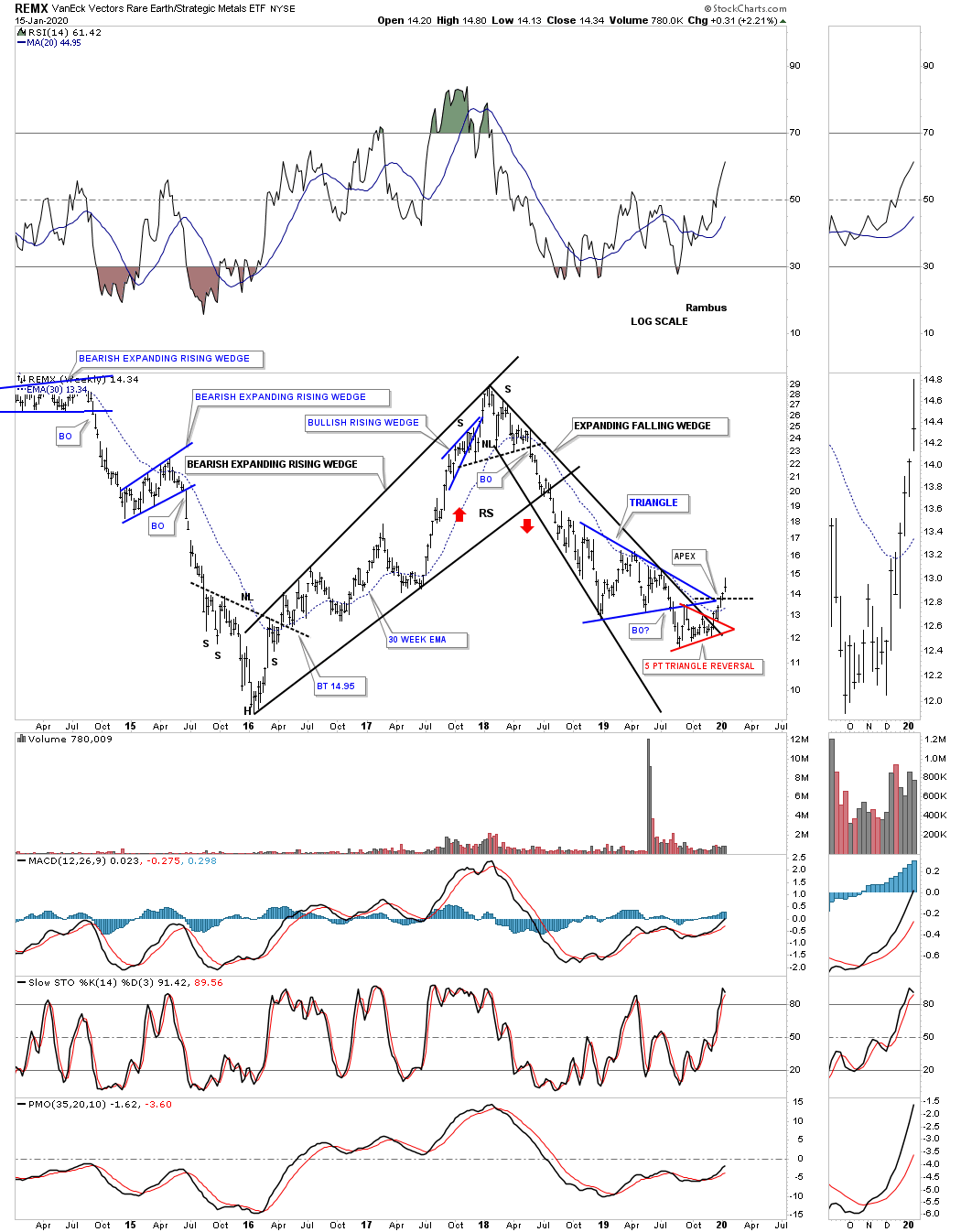
Next is a weekly chart for the REMX, Rare Earth etf, which appears to be reversing the REMX to the upside after completing the 5 point red bullish triangle reversal pattern. The price action is also trading above the apex of the blue triangle.
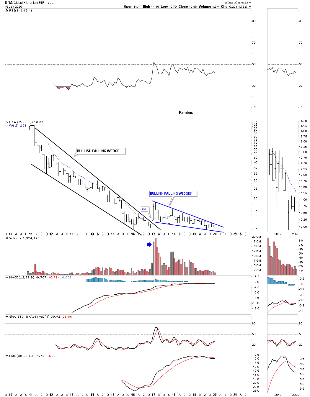
The URA, uranium etf, is trading close to its all time lows. If the price action can trade above the 4 year falling wedge formation it could finally reverse the bear market to a bull market. More work still needs to be done, but it’s time to keep an eye on this etf.
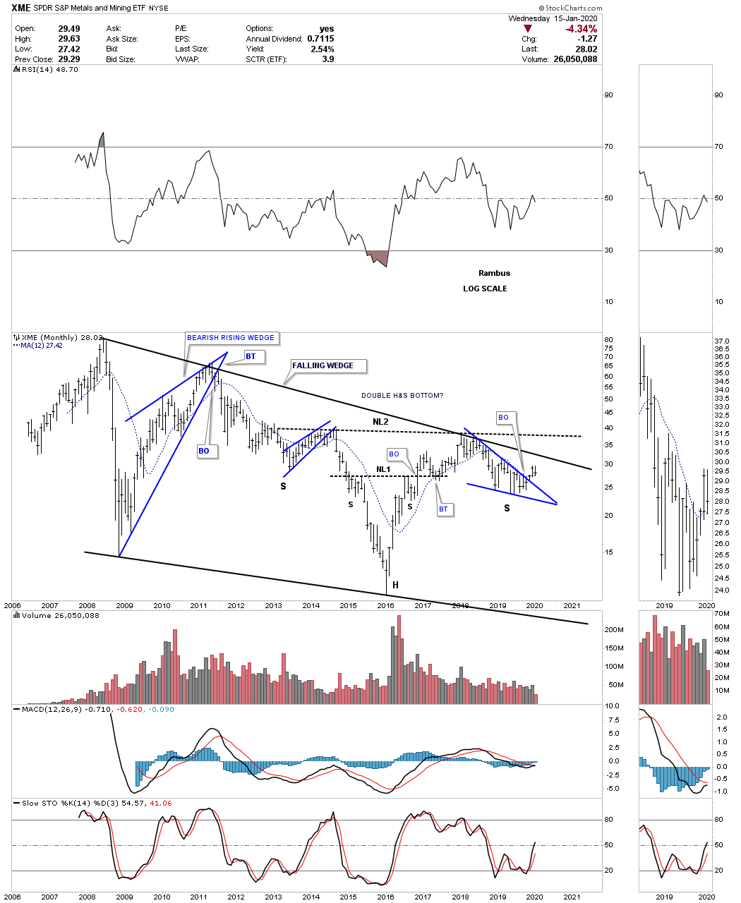
Next is a weekly chart for the XME, metals and mining etf, which has recently broken out from the 2018 bullish falling wedge and is currently in backtest mode.
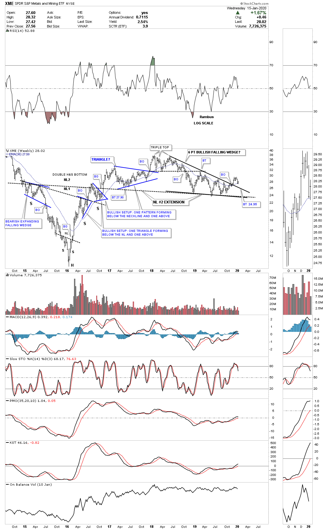
This long term monthly chart for the XME shows a very large 7 year H&S bottom with a backtest to the neckline underway.
Another important area for the commodities complex is this weekly chart for the XLB, basic materials sector, which has broken out from the 2018 H&S consolidation pattern with two backtests to the neckline around the 59.00 area.
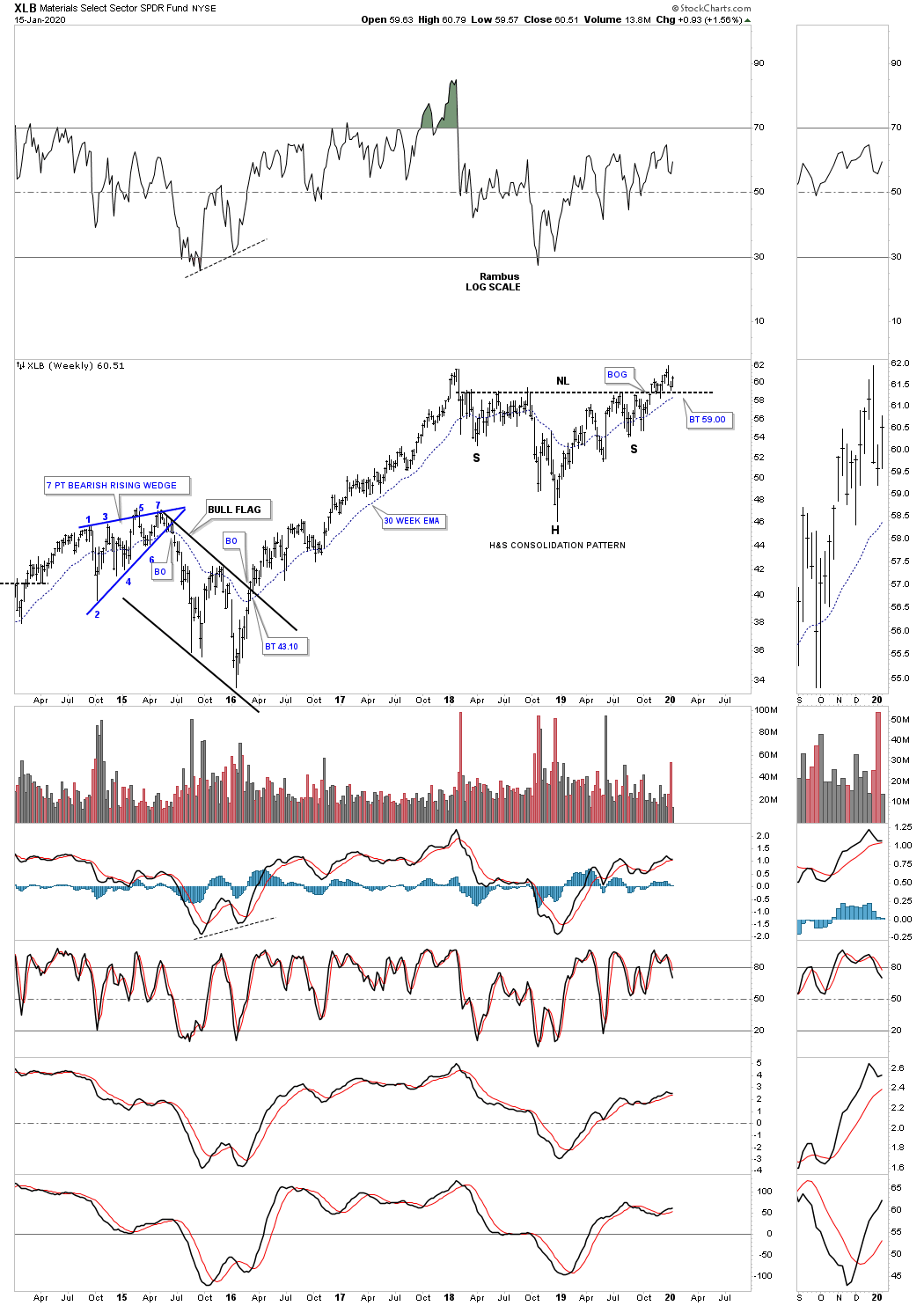
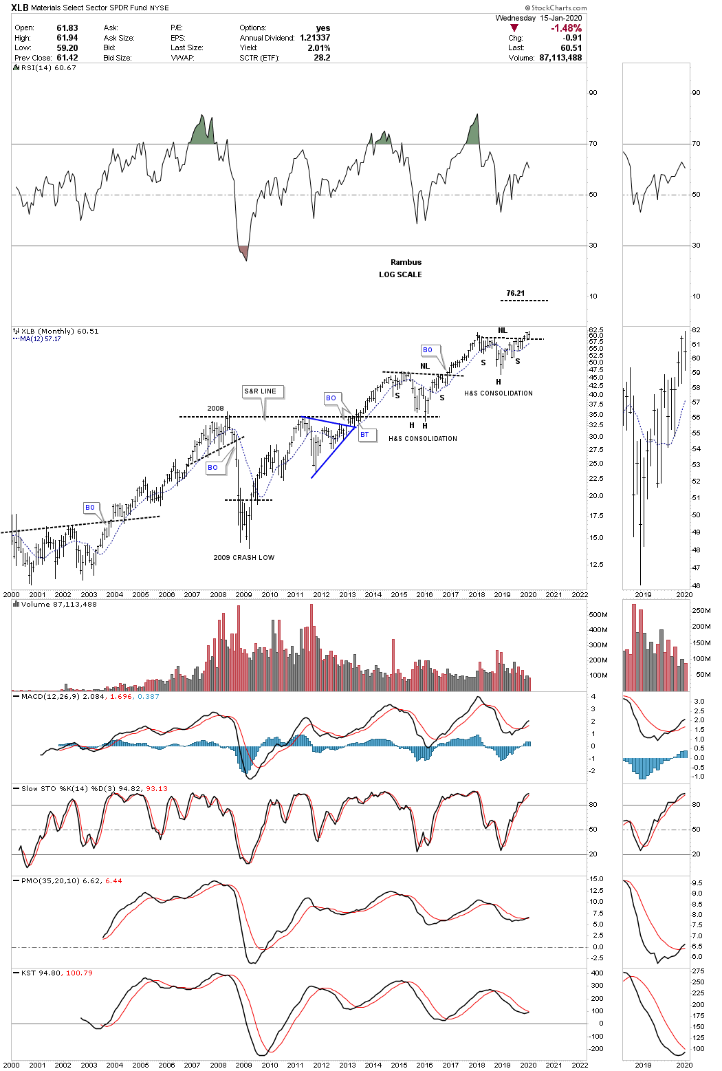
Below is the long term monthly chart for the XLB which shows 2 H&S consolidation patterns since the 2009 low.
The USO, oil fund, is trading fairly close to its lows, but is forming a possible 5 point bullish expanding rising wedge formation if it can takeout the top rail. The rising wedge formation is now 4 years in the making.

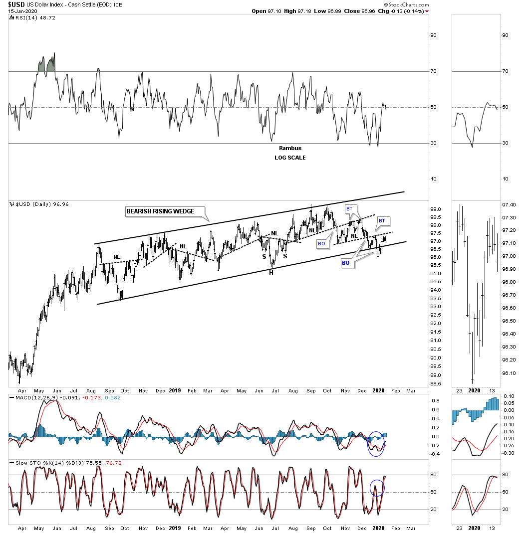
Now lets turn our attention to the US dollar which has been forming a rising wedge formation since the August 2018 low. The breaking out and backtesting process to the bottom rail of the rising wedge formation has been a little sloppy. We need to see the US dollar trade below the previous low to gain more confidence that the breakout is truly underway.
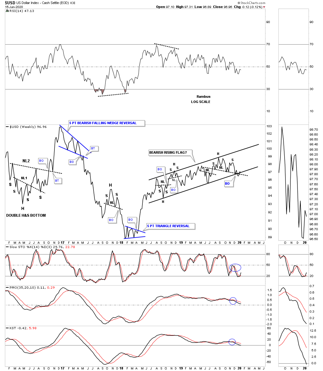
This long term weekly line chart for the US dollar shows the rising flag formation with the possible H&S top forming at the top of the of rising wedge. Its close to breaking out but not quite there yet.
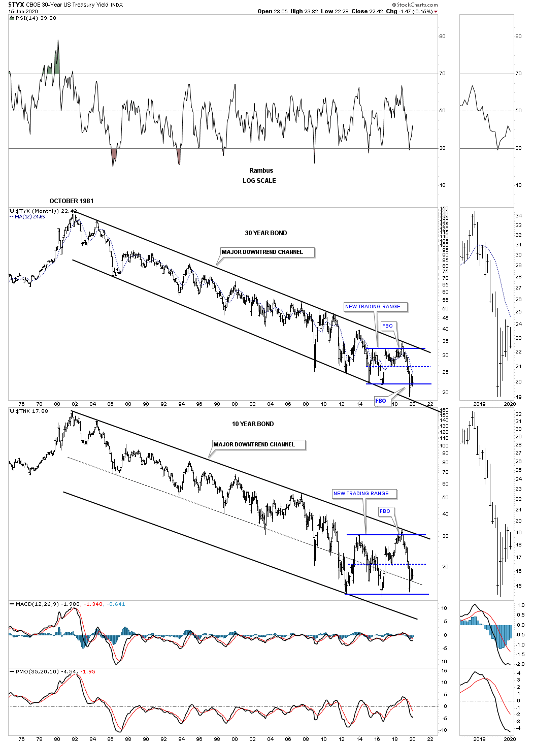
This last chart for the Quarterly Report is a long term monthly combo chart which has the 30 year bond yield on top with the 10 year bond yield on the bottom. As you can see the price action has been trading sideways at the bottom of the October 1981 low. When will the 1981 downtrend channel make up its mind on which direction the next big move will take place is anyones guess. This trading range could last longer than most think possible.
If oil could start to rally in a meaningful way that would be good for many of the commodity indexes which are heavily skewed with oil. A stronger oil price, but not to strong, would also be good for the US stock markets as it would show a strong demand for oil from a growing economy. Since the last Quarterly Report, the US stock markets have broken out from their 2018 trading range consolidation patterns continuing their impulse move higher. The PM complex had a decent move higher and has reached the top of the August trading range in some if the PM stock indexes.
All in all it was a great 4th quarter with just about everything in rally mode in most cases. At some point the US stock markets are going to need a rest to consolidate its one year impulse move higher. The 2016 impulse move lasted exactly 2 years so the odds are good that our current impulse leg should last at a minimum of 2 years if not longer.
All the best…Rambus
Related Reading:
- Rambus: Blockbuster Chartology – October, 2019
- Rambus: Blockbuster Chartology – July, 2019
- Rambus: Blockbuster Chartology – April, 2019
- Rambus: Blockbuster Chartology – January, 2019
- Rambus: Blockbuster Chartology – October, 2018
- Rambus: Blockbuster Chartology – July, 2018
- Rambus: Blockbuster Chartology – April, 2018
- 2017 Annual Wrap Up – Does Your Pension Fund Have A Deep State Drain? – January, 2018
- 1st Quarter Wrap Up 2018 Web Presentation
- Blockbuster Chartology with Rambus – October, 2017
- Blockbuster Chartology with Rambus – July, 2017
- Blockbuster Chartology with Rambus – May, 2017
- Blockbuster Chartology with Rambus – January, 2017
- Blockbuster Chartology with Rambus – October 20, 2016
- Blockbuster Chartology with Rambus – July 21, 2016
- Blockbuster Chartology with Rambus – April 21, 2016
- Rambus: Are We in a Deflationary Spiral? – January 28, 2016
- The Dollar, Gold & the S&P 500 with Rambus – October 15, 2015